June 2026 S M T W T F S « Feb 1 2 3 4 5 6 7 8 9 10 11 12 13 14 15 16 17 18 19 20 21 22 23 24 25 26 27 28 29 30 Search
Reviews by Category
-
Recent Posts
Archives
- February 2022 (1)
- January 2022 (2)
- December 2021 (2)
- November 2021 (5)
- October 2021 (4)
- September 2021 (4)
- August 2021 (5)
- July 2021 (4)
- June 2021 (6)
- May 2021 (5)
- April 2021 (4)
- March 2021 (5)
- February 2021 (5)
- January 2021 (5)
- December 2020 (5)
- November 2020 (5)
- October 2020 (9)
- September 2020 (8)
- August 2020 (6)
- July 2020 (7)
- June 2020 (11)
- May 2020 (6)
- April 2020 (8)
- March 2020 (5)
- February 2020 (8)
- January 2020 (5)
- December 2019 (8)
- November 2019 (6)
- October 2019 (11)
- September 2019 (11)
- August 2019 (8)
- July 2019 (12)
- June 2019 (10)
- May 2019 (8)
- April 2019 (5)
- March 2019 (4)
- February 2019 (4)
- January 2019 (4)
- December 2018 (16)
- November 2018 (20)
- October 2018 (25)
- September 2018 (20)
- August 2018 (26)
- July 2018 (25)
- June 2018 (23)
- May 2018 (25)
- April 2018 (28)
- March 2018 (24)
- February 2018 (23)
- January 2018 (26)
- December 2017 (12)
- November 2017 (10)
- October 2017 (37)
- September 2017 (48)
- August 2017 (19)
- July 2017 (30)
- June 2017 (30)
- May 2017 (44)
- April 2017 (32)
- March 2017 (49)
- February 2017 (32)
- January 2017 (54)
- December 2016 (29)
- November 2016 (36)
- October 2016 (39)
- September 2016 (31)
- August 2016 (49)
- July 2016 (64)
- June 2016 (52)
- May 2016 (52)
- April 2016 (66)
- March 2016 (72)
- February 2016 (60)
- January 2016 (59)
- December 2015 (72)
- November 2015 (81)
- October 2015 (59)
- September 2015 (41)
- August 2015 (33)
- July 2015 (30)
- June 2015 (25)
- May 2015 (42)
- April 2015 (40)
- March 2015 (32)
- February 2015 (25)
-
Net Galley
Author Archives: Iiiireader
Another Beautiful Beginner level Grayscale book with 20 Fantasy Designs in Dark Contrast Grayscale with how-to tips
Spellbinding Images: A Grayscale Fantasy Coloring Book: Beginner’s Edition (Volume 2)
By: Nikki Burnette
Rating: 5 of 5
This is my second volume of Nikki Burnette’s Spellbinding Grayscale coloring books at the beginner level. I am just learning how to do grayscale, having started with it just this year. Because of issues I have had with another book, Ms. Burnette’s book was recommended to me. I’m so glad I followed everyone’s advice because Ms. Burnette not only has great designs to color, she also provides many how-to tips that have challenged me to try new ways of coloring both grayscale and with my regular coloring books as well.
Before getting buying this series of books, I only used colored pencils with grayscale. Because of the suggestions in these books, I am now using water-based and alcohol-based markers and even gel pens with my grayscale not only in these books but in my other grayscale books as well. I highly recommend this book for anyone interested in learning grayscale as the tutorial is so well-written.
This is yet another beautiful set of fantasy designs. In addition to the 20 designs being printed on one side of the page, Ms. Burnette has included thumbnail color samples of each design along with two additional thumbnails in which you can test your own colors and mediums. I am definitely using the thumbnails to try out colors and find that it is extremely helpful It feels like the artist has done just about everything but color the design for me to help me with my choices and coloring methods.
The artist also has a tutorial on her website which has proved invaluable as well. If all of this wasn’t enough, she has graciously provided permission to copy her designs onto other forms of paper if your coloring medium doesn’t work well on the paper in this book. The paper is a medium weight that has what she calls a satin sheen and to me, a glossy feel to it.
The designs are printed on one side of the page. The page is non-perforated but I find it opens to a flat position very easily. The designs all stop well before the binding, so you won’t have to twist and tweak the page and book to color in it. You also have room to remove pages if you choose to do so.
I was so impressed with my first purchase of Volume 1 of this series, I knew that I would be buying future books when I found them. I now have volume 2 in both the beginner and advanced form (definitely more challenging) and will be looking forward to more grayscale books by this artist in the future.
Posted in Adult Color Books
Leave a comment
Another beautifully illustrated classic storybook coloring book printed on both sides of the page
Color the Classics: Beauty and the Beast: A Deeply Romantic Coloring Book
By: Jae-Eun Lee
Rating: 5 of 5
t the time I am writing this review, there are now three classic storybook coloring books released by Jae Eun Lee. I was less pleased by the number of simply story book pages as compared fully coloring pages in the first release Anne of Green Gables. In Alice In Wonderland and now again, in Beauty and the Beast, I appreciate that there are more coloring pages and that some of the story is inset in those pages instead of taking up a lot of the book with story. Of the 72 design pages in Beauty, only 14 are simply illustrated story book pages. Note that the book is listed as having 85 pages but that includes title pages, the foreward, and the thumbnails images at the back of the book.
To be clear, the story portrayed in this book is not the happy, feel-good version that we have seen on the big screen. This story goes back to the roots of the tale and includes some less than happy characters (for instance, Beauty’s sisters apparently plot to have the Beast devour Beauty.) While the story harkens back to the original, it is in no way complete. You may want to pick up a classic telling of the story to keep along side the coloring book for future reading and reference.
I really love the illustrations in this book as I have the two prior ones. Artist Jae Eun Lee has a beautiful ability to draw and make the scenes highly romantic. I found that the designs were open and flowing and easy to color without resorting to specialty pens to get into tiny spots.
For my first two projects in this coloring book, I chose to do first a design of Beauty with the Beast and then for the second design, I chose a lovely design of hands in lace partial gloves. I used Caran D’Ache Pablo oil-based Colored Pencils. While I found that these, as well as other oil-based pencils did not blend as well, I liked the way the pencils worked with the paper otherwise and I used them more for layering colors than for any blending. I might have used Verithins for the lacework but I am trying to keep my coloring pencils consistent within each book in this series. For fun, I will use a different brand of colored pencils for each book going forward to give each one a slightly different appearance.
Here is what I found in a brief overview:
72 pages of Designs and Story Book Illustrations
Printed on both sides of page
Pages are heavyweight, slightly smooth and non-perforated
Glue Binding
Some Designs merge into the binding
Some Designs spread across two pages
Alcohol-based markers bleed through the page
Water-based markers do not bleed through
India ink pens do not bleed through
Gel pens do not bleed through but require extra drying time
Coloring pencils did well in laying down good color with this paper. I was able to use them with a light touch as well as with multiple layers for a more solid appearance. Colors also layered well over other colors. Wax-based pencils did better at blending than did oil-based colors but both were acceptable for my use. Hard lead pencils did not did through the back of the book.
Posted in Adult Color Books
Leave a comment
51 Lovely Hand-drawn Sea Form designs printed on one side of the page
Drawn to the Sea: A Colouring Book of Sea Forms
By: Sabrina Impieri
Rating: 4 of 5
Drawn to the Sea is my first coloring book by Sabrina Impieri. She has a lovely free-flowing design style that suits sea forms. The designs in this book are line drawings of sea creatures and plant life. I find them open and easy to color without an extreme amount of detail or tiny spots to color.
The designs were fairly free-form rather than realistic. I like to see an artist’s interpretation, so this is something I do appreciate. There were a number of designs that used circles or bubbles. There seemed to be three types of use for these: 1) as part of the design (as with my project, I used them to show water without having to color the entire background), 2) some use as a form of pointillism to give the shape of another object, and 3) decorative and without as much meaning. In the first two uses, I would showcase the circles. In the last one, I would try to blend them in rather than bring attention to them if they were too distracting.
In my first project, I used Tombow water-based brush markers to color a crab in the ocean. I really liked the way the designs looked with watercolor and it allowed me to layer colors and blend them to get the effect that I was looking for.
This is what I found in coloring and testing this book:
51 Hand-drawn artistically interpreted Sea Form Designs
Printed on one side of the page
Paper is typical CreateSpace paper thin, white, slightly rough and non-perforated.
Glue Bound
Designs do not merge into the binding area
Alcohol and water-based markers bleed through the page (I suggest you use a blotter page under your work.)
Gel pens and India ink leave colorful shadows on the back of the page.
Coloring pencils work well with this paper both oil and wax based pencils lay down good color, layer and blend well. Hard pencils dent the back of the page.
While I could wish for thicker, perforated paper, it appears that this is the quality that comes from CreateSpace (which is an Amazon company.) What I really like about the CreateSpace is it is a way that independent artists can get their work self-published. That way, I get a huge choice of design styles albeit with not the best paper.
I was provided a free copy of this coloring book for test and review purposes.
Posted in Adult Color Books
Leave a comment
49 Designs including 39 in Grayscale Pointillism and 10 line drawings by Nadiya Vasilkova printed on one side of the page
Magic totem: Coloring Book for Grown-Ups, Adult. Beautiful decorative animals, birds, flowers
By: Nadiya Vasilkova
Rating: 5 of 5
I’m fairly new to working with grayscale coloring and Nadiya Vasilkova’s designs are the only ones that I have done in pointillism grayscale. It was with great pleasure that I discovered that she had recently published a large number of her beautiful animal designs in this coloring book. In addition to 34 wonderful animals, there are an additional 5 similar designs in a variety of subjects as well as 10 great line drawings with slight amounts of pointillism that I can use for regular coloring.
The majority of this coloring book is printed in pointillism style. This is the style that was developed by Georges Seurat and Paul Signac during the 1800’s. I’m not as familiar with Mr. Signac’s work but I have seen (and studied in art history) some of Mr. Seurat’s works such as A Sunday Afternoon on the Island of La Grande Jatte.
In pointillism, the image is created by using very small uniform dots of color in place of the brush strokes we are used to seeing in paintings. Similar to Impressionism, the further you stand from a pointillism painting, the more you see the overall effect. The designs in this book are not printed in color but rather in varying shades and density of gray.
As with regular with grayscale coloring, you choose your colors based on the design. Light colors with light dots or areas where there are no dots, medium with medium, and dark with dark or densely dotted areas. I’ve mostly used colored pencils with my grayscale but have recently begun using a variety of markers as well.
For my first two projects in this book, I used markers. With the lion, I then went over the entire designs with colored pencils as well. Using markers has given me a very different look to my projects and is something that I am pleased to be trying and learning.
This is what I found in coloring and testing this book:
49 Beautiful Designs with 39 in pointillism style
Printed on one side of the page
Paper is typical CreateSpace paper thin, white, slightly rough and non-perforated.
Glue Bound
Designs do not merge into the binding area
Alcohol and water-based markers bleed through the page (I suggest you use a blotter page under your work.)
Gel pens and India ink leave colorful shadows on the back of the page.
Coloring pencils work well with this paper both oil and wax based pencils lay down good color, layer and blend well. Hard pencils dent the back of the page.
Posted in Adult Color Books
Leave a comment
31 Cute and Adorable Dog Designs by Marjorie Sarnat – printed on one side of the page
Creative Haven Dazzling Dogs Coloring Book
By: Marjorie Sarnat
Rating: 5 of 5
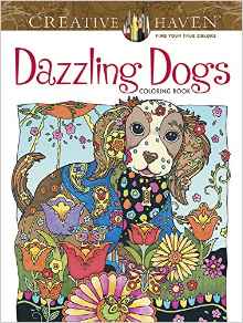
I am a big fan of Marjorie Sarnat’s animal coloring books. In the Creative Haven line, “Dazzling Dogs” is her third such book following her highly successful Cats and Owls coloring books.
In this coloring book, once again Ms. Sarnat provides a wonderfully and whimsical look at the world of dogs. Her hand-drawn designs are highly detailed with lots of fun coloring elements. So many of the designs take almost a collage look at each dog with items surrounding them to give you the whole picture of what that particular dog(s) is involved with.
Posted in Adult Color Books
Leave a comment
63 Beautifully Drawn Images of Traditional and Vintage Cuba by Marty Noble – printed on one side of the page
Creative Haven Hello Cuba! Coloring Book
By: Marty Noble
Rating: 5 of 5
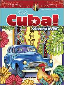
“Hello Cuba” by Marty Noble contains 63 designs which is a great value as most Creative Haven coloring books contain 31 or less. I really like that the artist and publisher grouped more together in the one book rather than to spread it out over two books as well as over time. I hope to see more of this expanded subject style coloring book in the future.
The designs are beautifully drawn as all of Ms. Noble’s designs are. There is a wide variety of subjects, including: dancers, advertising (including vintage magazine covers), workers, vintage cars (which are still what are used in Cuba today), animals, flowers and plant life, beautiful landmark and other daily scenes, and of course, tobacco.
Posted in Adult Color Books
Leave a comment
31 Beautifully illustrated Victorian Houses printed on one side of the page
Creative Haven Victorian Houses Architecture Coloring Book (Adult Coloring)
By: A. G. Smith
Rating: 5 of 5
There are 31 beautifully illustrated architectural designs of Victorian Houses in this coloring book. The designs are re-prints from two prior Dover books, Victorian Houses 2001 and The American House Styles of Architecture Coloring Book 1983. While I don’t have either of the previous books, I have seen images of designs from them. What is different about this book is that 1) the designs are printed on one side of the page and 2) the description of the house is now printed on the back of the page instead of the bottom of the page. Based on the size of the designs, I would like that they may have enlarged the designs a bit as well as there was no longer a need to accommodate the printed words.
The designs are really lovely. My husband grew up living in an older Victorian house and I enjoyed visiting it. Where I grew up (Southern California), Victorian Houses didn’t abound. I always enjoyed visiting San Francisco and seeing the lovely houses that still stood after their devastating earthquake in the early 1900’s. I’ve also enjoyed cross stitching a number of Victorian houses, so I was pleased to be able to get this book.
While the designs have a definite architectural look to them, the artist also included background scenes and people who inhabit the homes. The designs are detailed but not too intricate. For my first project, I chose a seaside house similar to one of my husband’s relatives homes. The book describes it as a seaside cottage in the Stick style from 1881. I used a variety of alcohol-based markers to finish the design. I will include a photo of this as well as the two pages of four colored samples from the coloring book.
This is what I found in coloring and testing this book:
31 Victorian Houses (reprints from previous Dover coloring books) with description of house and style on the back of the page.
Printed on one side of white page
Page is white, slightly rough, and perforated
Glue Bound
Designs stop before the perforation and have a framing line on the outside of the designs.
Alcohol and water based markers seep through this paper. The alcohol markers bleed through immediately while the water-based markers leave heavy spots of color. I use a blotter page under my working page or I remove each page at the perforation before coloring.
Gel pens and India ink pens leave shadows of color on the back of the page
Coloring pencils work well with this standard Creative Haven paper. Soft lead lays down good color, layers and blends well. Hard lead pencils leave dents on the back of the page.
Posted in Adult Color Books
Leave a comment
31 Architectural Coloring Designs of American Houses through history printed on one side of the page
Creative Haven The American House Architecture Coloring Book (Adult Coloring)
By: A. G. Smith
Rating: 5 of 5
There are 31 designs in this coloring book which are, according to the blurb at the front of the book, a new selection of plates from The American House Styles of Architecture Coloring Book originally published in 1983. While I don’t have that book or another one from 1988 that may contain some or most of the designs in this book, I have seen designs from both. What is different about this book is that 1) the designs are printed on one side of the page and 2) the description of the house is now printed on the back of the page instead of the bottom of the page. Based on the size of the designs, I would like that they may have enlarged the designs a bit as well as there was no longer a need to accommodate the printed words.
The designs begin with a Saltbox house (Jethro Coffin House, Nantucket circa 1686) and continue through the history of American homes and ending with a Sustainable style house (designed by John Milnes Baker, 1981.) What is interesting to note is that the last home would have been very current when the first coloring book was published in 1983 but is now 35 years old and newer styles of architecture are not present in this coloring book.
I enjoyed that the artist included people and backgrounds to the architectural designs. It made coloring even more fun. For my first project, I chose to do a New England Georgian house (Richard Derby House, Salem Massachusetts, 1762.) The house style is one of symmetry and is made of brick construction. I used a variety of alcohol-based markers to finish the design. I will include photos of it as well as the two colored samples from the book.
This is what I found in coloring and testing this book:
31 Historical styles of American houses (reprints from previous Dover coloring book) with description of house and style on the back of the page.
Printed on one side of white page
Page is white, slightly rough, and perforated
Glue Bound
Designs stop before the perforation and have a framing line on the outside of the designs.
Alcohol and water based markers seep through this paper. The alcohol markers bleed through immediately while the water-based markers leave heavy spots of color. I use a blotter page under my working page or I remove each page at the perforation before coloring.
Gel pens and India ink pens leave shadows of color on the back of the page
Coloring pencils work well with this standard Creative Haven paper. Soft lead lays down good color, layers and blends well. Hard lead pencils leave dents on the back of the page.
Posted in Adult Color Books
Leave a comment
31 Tropical Designs including birds
Creative Haven Paradise Designs Coloring Book (Adult Coloring)
By: Ted Menten
Rating: 5 of 5
This is my first coloring book by Ted Menten. I can see that he has been heavily involved with previous Dover books, including coloring books and paper dolls. The artwork in this book is new and has not been previously published.
The hand-drawn designs show a tropical paradise. I lived in Southern California for most of my life and many of the lush settings and plants are very familiar to me. One of the things I miss most since moving away is the beautifully colored flowers that one can see year round. I also visited Hawaii a number of times in my life and many of the designs in this book bring those vacations to mind as well.
The designs are detailed without being overly intricate. Each designs has beautiful flowers and generally has either a bird or butterfly as well. For my first projects, I chose a design with a toucan and two of my favorite tropical flowers a bird of paradise and a hibiscus. I grew both of these flowers in my old garden and it was lovely to be able to color and think of those days. I will include a photo of the project as well as the two colored samples from the book.
This is what I found in going through this coloring book:
31 Hand-drawn Tropical designs
Printed on one side of white page
Page is white, slightly rough, and perforated
Glue Bound
Designs stop before the perforation and have a framing line or finished elements at the outside edges.
Alcohol and water based markers seep through this paper. The water-based more or less spot through heavily but the alcohol based flow through immediately. I use a piece of card stock under my working page to keep ink from leaking through. You can also remove each page at the perforation before coloring.
Gel pens and India ink pens leave shadows of color on the back of the page
Coloring pencils work well with this standard Creative Haven paper. Soft lead lays down good color, layers and blends well. Hard lead pencils leave dents on the back of the page.
Posted in Adult Color Books
Leave a comment
31 Egyptian motifs in Art Deco Styles printed on one side of the page
Creative Haven Art Deco Egyptian Designs Coloring Book (Adult Coloring)
By: Dover
Rating: 5 of 5
The concept of this coloring books is interesting. The designs include classical Egyptian motifs which have been presented in an Art Deco type of style and adapted from designs by Paul Marie. I noticed that many of the type of motif are used throughout the entire book.
The book is not original but instead is based on a Dover book from 2011 (which itself was a reprint of an older French book. The disclaimer in this book says it is a new selection of prints from Egyptian Motifs in the Art Deco Style. I assume that means that there were more than 31 designs in the first book. Also, it doesn’t sound as if the first book was a coloring book. I don’t know if this book has been modified or not for use in coloring but I can say that the designs are very detailed, intricate, and have very small spots for coloring.
The designs are all quite beautiful. For my first project, I chose a design that includes many of the motifs in the book. I used Copic alcohol-based markers and instead of coloring each tiny spot separately, I chose to use a single color over many tiny spots. I can then go over it with very sharp pointed colored pencils to add details. I will include photos this project as well as the two colored samples from the book.
To color some of the detailed elements in this book, you may need to have very small nib pens and markers to get into the little spots. I’ve found that gel pens in 0.28 and 0.38 are great for this type of detail.
This is what I found in coloring and testing this book:
31 Egyptian Motif Designs in Art Deco style
Printed on one side of white page
Page is white, slightly rough, and perforated
Glue Bound
Designs stop before the perforation and have a framing line or finished elements at the outside edges.
Alcohol and water based markers seep through this paper. The alcohol markers bleed through immediately while the water-based markers leave heavy spots of color. I use a blotter page under my working page or I remove each page at the perforation before coloring.
Gel pens and India ink pens leave shadows of color on the back of the page
Coloring pencils work well with this standard Creative Haven paper. Soft lead lays down good color, layers and blends well. Hard lead pencils leave dents on the back of the page.
Posted in Adult Color Books
Leave a comment