Inspirational Coloring Book for Girls: Hours of Faith-Filled Fun
By: Christian Art Kids
Rating: 5 of 5
This is a wonderful book filled with many Christian-based designs. I also want to mention immediately that it is one of the best made coloring books that I have purchased but more about that later. The actual designs have a beautiful, hand-drawn sketch look and feel to them. In addition to the 50 designs, there are bookmarks and cards you can color and cut out.
The book is definitely geared towards females as all the figures in the book are girls. However, many of the designs can easily be colored by all as they are gender neutral. My husband colors as well and he likes many of the designs in this book, too.
What I love about the book is that almost every one of the designs is Christian-based. Many Christian coloring books only devote one third or so of the design pages to providing a Christian message. This one is packed full of designs meant to inspire and encourage. While it may have been meant for a younger target audience, I find that as an adult, I am happy to color these designs as well.
The book is very well made. The cover is extremely strong hardboard. It is printed on one side only of heavyweight perforated paper. The binding is at the top and is spiral bound. The print quality is excellent and dark. I really appreciate this binding as you can flip to any page and have access to the entire design. The cover then becomes a portable desk which allows you to color easily when on-the-go. While I am not a lefty, spiral bound works fantastic for them as they don’t have to color over the hump of the binding. A few of the designs extend beyond the perforations, which is a little frustrating. I won’t remove these from the book as I will lose a bit of the design if I do. This could be easily solved in future additions to this series by sizing the design to fit below the perforations.
This is printed on fantastic paper. None of my markers bled through and that includes all of my alcohol-based markers. Gel pens worked fantastic as well and did not bleed through or leave shadows at the back. Coloring pencils worked nicely as well and behaved according to their type of lead (soft/hard core.)
These are the coloring medium that I use for testing. If there is something else you feel I should be testing, please let me know and I will see if I can add it to my growing pile:
Markers: 1) alcohol-based Copic Sketch, Prismacolor double ended markers (brush and fine point), Sharpies (fine and ultra-fine) and 2) water-based Tombows dual end markers (brush and fine point), Stabilo 88, Staedler triplus fineliners, and Pentel markers
Gel Pens: Sakura, Fiskars, Uni-ball Signo 0.38/0.28 and Tekwriter
Coloring Pencils: Prismacolor Premier Soft Core, Derwent Colorsoft, Prismacolor Verithins, and Faber-Castel Polychromos
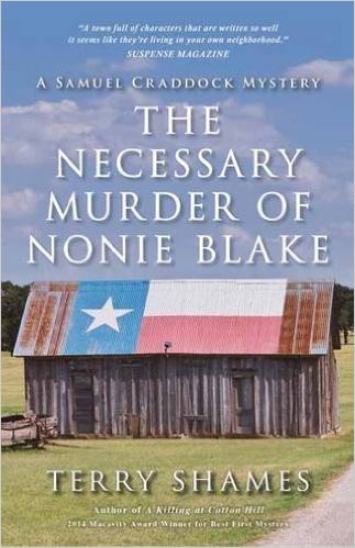
The Necessary Murder of Nonie Blake: A Samuel Craddock Mystery (Samuel Craddock Mysteries)
By: Terry Shames
Rating: 5 of 5
The author paints a realistic view of small town Texas life. I moved from California to Texas more than ten years ago and before that move, I would have thought the the characters and events in this book were a tad exaggerated. Turns out, I have learned better in the last decade. It is almost as if I know some of these individual. What is even more odd (considering I’m a long time big city girl), I love this about these small town folk.
This is a fun book of designs which center on the ocean. There is everything from fish to mermaids to light houses (and there is even a bear which I don’t quite understand but then again, I don’t know a lot about the habits of bears!) What I really like about the designs is that while they have a good amount of detail, the designs are open and easy to color. This is a great book for someone who loves the sea but can’t color in some of the other books which have teeny tiny details. A lot of the sea animals have doodle style designs within their outlines to give the colorist a lot of opportunity to use many colors in their project.
All of the designs stop well before the binding. The designs are printed on one side of thin white non-perforated paper that is typical for books published by CreateSpace. The binding is glued but there is plenty of room for you to cut a page out if you choose to do so. All of the designs have a framing line around the outside. I really like this as it gives me a natural stopping point, saves ink/pencil, and also gives me a more finished looking project when I color.
All of my markers bleed through and my gel pens either bleed through or leave a distinct shadow on the back of the page. My coloring pencils work well with the paper. I will use a piece of chipboard or heavy paper behind the page I am working on so I don’t ruin the following page with leaking ink.
Home is Where the Heart Is: A Hand-Crafted Adult Coloring Book
By: Steve Duffendack
Rating: 5 of 5
This is a pretty coloring book with filled with designs of things (including pets) that can be found in a home. The designs are all fairly easy to color and are very similar in style to other coloring books by this author. The book includes designs of wine bottles, dogs and cats, mixed drinks, flowers, bathtubs, pillows, and much more. This artist as a clean and stylized look to his designs. There is not a lot of intricate details that require tiny bits of color.
The book itself is really pretty, too. It has a dust jacket which can be colored, inside and out. The outside has a beautiful touch of red foil in addition to parts that are colored beautifully. The publishers missed an opportunity when they didn’t put coloring images on the actual cover of the book.
The designs are printed double-sided on a good heavyweight white paper. What is wonderful is that the pages are perforated for easy removal. There are nine designs which appear to be spread across two pages and which will be divided if you remove the pages from the book. The good news is that all but one of them (the free-standing desk) can easily stand-alone as single page designs. The binding is sewn rather than glued so you can remove a few pages at a time by snipping a few threads.
Architectural Art Vol. 2: A Stress Management Coloring Book For Adults
By: Penny Farthing Graphics
Rating: 5 of 5
There are 60 architectural images in this second volume of Architectural Art from Penny Farthing. Once again, there is a variety of building types. What is different this time is that there are fewer older European style homes and instead there are a number of Asian homes and churches. There are a number of modern designs and even a very geometric design of a building in the girder stage. The designs range from open and easy to color to more intricate with a little more challenge.
I find coloring architectural designs to be vastly different from my usual flowers, animals, and folk art. Every once in a while, it is great to pull out something so beautifully graphic and just spend time coloring the building the way I would want it to look. It almost feels like a palate-cleansing coloring experience that lets me try something so out of my norm. I also own the first book in this series and enjoyed it so well, I bought this one as soon as it was made available.
I own a few books by Penny Farthing Graphics. They are published via CreateSpace which is generally used for self-publishing. The designs are drawn by a variety of artists from all over the world and are licensed via Shutterstock.com (which seems to be a front-runner in design licensing). What we end up with is a great coloring book (although on thin paper) with a large and varied selection of designs.
The pages are printed on thin white paper which is not perforated which is typical of books published by CreateSpace. The designs are printed on one side of the page with the back left blank. The designs stop well short of the glued binding and can easily be removed with a pen knife if you so choose.
My gel pens and markers all leaked through this paper. My coloring pencils went on well but left a shadow at the back of the page, too. Not a problem, though, as I can put a piece of chipboard or a couple of heavy weight pieces of paper under the page I am working on to keep the ink from leaking through.
These are the coloring medium that I use for testing. If there is something else you feel I should be testing, please let me know and I will see if I can add it to my growing pile:
Markers: 1) alcohol-based Copic Sketch, Prismacolor double ended markers (brush and fine point), Sharpies (fine and ultra-fine) and 2) water-based Tombows dual end markers (brush and fine point), Stabilo 88, Staedler triplus fineliners, and Pentel markers
Gel Pens: Sakura, Fiskars, Uni-ball Signo 0.38/0.28 and Tekwriter
Coloring Pencils: Prismacolor Premier Soft Core, Derwent Colorsoft, Prismacolor Verithins, and Faber-Castel Polychromos
Train Coloring Book: A Stress Management Coloring Book For Adults
By: Penny Farthing Graphics
Rating: 5 of 5
I have several coloring books by Penny Farthing Graphics in my collection. They are published via CreateSpace which is generally used for self-publishing. The designs are drawn by a variety of artists from all over the world and are licensed via Shutterstock.com. What we end up with is a great coloring book (although on thin paper) with a large and varied selection of designs.
This book contains an assortment of designs of trains and train-related items. The trains range from fairly simple outline forms to others that are more detailed and challenging to color. The trains also range from modern to antique. These are not, for the most part, scenes with trains in them but line drawings of trains. There are also views of track, inside the train, etc. Because the images are licensed from a variety of artists, the look and feel of the designs vary greatly.
All of the designs stop well before the binding. The designs are printed on one side of thin white non-perforated paper that is typical for books published by CreateSpace. The binding is glued but there is plenty of room for you to cut a page out if you choose to do so.
All of my markers bleed through and my gel pens either bleed through or leave a distinct shadow on the back of the page. My coloring pencils work well with the paper. I will use a piece of chipboard or heavy paper behind the page I am working on so I don’t ruin the following page with leaking ink.
While I could wish for thicker, perforated paper, it appears that this is the quality that comes from CreateSpace (which is an Amazon company.) What I really like about the CreateSpace is it is a way that independent artists can get their work self-published. That way, I get a huge choice of design styles albeit with not the best paper.
These are the coloring medium that I use for testing. If there is something else you feel I should be testing, please let me know and I will see if I can add it to my growing pile:
Markers: 1) alcohol-based Copic Sketch, Prismacolor double ended markers (brush and fine point), Sharpies (fine and ultra-fine) and 2) water-based Tombows dual end markers (brush and fine point), Stabilo 88, Staedler triplus fineliners, and Pentel markers
Gel Pens: Sakura, Fiskars, Uni-ball Signo 0.38/0.28 and Tekwriter
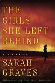
I was able to dive right into the action of “The Girls She Left Behind” without having read the first book in the series. I enjoyed the book well enough that I will certainly go back and read the first novel as it will undoubtedly fill in a lot of the background information on the characters. While that would be nice to have read, it wasn’t necessary for the action of the mystery in this book.
Lizzie Snow is a big city cop who has moved to a small town in Maine in hopes of finding her young niece, who was abducted years before in the same crime that left her motherless. There is a continued element in this story where Lizzie has her hopes raised and dashed or fears raised and relieved with regards to her niece.
Adult Coloring Books: Animals – Stress Relief Coloring Book
By: Adult Coloring Book World
Rating: 5 of 5
This is a cute book of animal designs which have been hand-selected by the publishers (which means that they have licensed the images from the artists) from around the world. This gives us a variety of styles and designs within one book instead of having to purchase multiple books. Most of the designs in the book are full body but a few (such as the cover) are head shots. The designs are mostly fairly simple to color but have enough detail to make coloring them fun. For the price, it is a great book to pick up if you are an animal lover and you like to finish your designs quickly.
All of the designs stop well before the binding. The designs are printed on one side of thin white non-perforated paper that is typical for books published by CreateSpace. The binding is glued but there is plenty of room for you to cut a page out if you choose to do so.
All of my markers bleed through and my gel pens either bleed through or leave a distinct shadow on the back of the page. My coloring pencils work well with the paper. I will use a piece of chipboard or heavy paper behind the page I am working on so I don’t ruin the following page with leaking ink.
While I could wish for thicker, perforated paper, it appears that this is the quality that comes from CreateSpace (which is an Amazon company.) What I really like about the CreateSpace is it is a way that independent artists can get their work self-published. That way, I get a huge choice of design styles albeit with not the best paper.
These are the coloring medium that I use for testing. If there is something else you feel I should be testing, please let me know and I will see if I can add it to my growing pile:
Markers: 1) alcohol-based Copic Sketch, Prismacolor double ended markers (brush and fine point), Sharpies (fine and ultra-fine) and 2) water-based Tombows dual end markers (brush and fine point), Stabilo 88, Staedler triplus fineliners, and Pentel markers
Gel Pens: Sakura, Fiskars, Uni-ball Signo 0.38/0.28 and Tekwriter
Coloring Pencils: Prismacolor Premier Soft Core, Derwent Colorsoft, Prismacolor Verithins, and Faber-Castel Polychromos
Color Me Beautiful, Women of the World: Adult Coloring Book
By: Jason Hamilton
Rating: 5 of 5
This is my third coloring book by Jason Hamilton. I have become a real fan with his wonderful representations of cats (on quilts and with Santa in previous coloring books.) I am extremely pleased with the gorgeous designs in this new book.
The artist has created a unique coloring book in that he has three levels of design levels. Each of the levels has ten designs. The first level is Simple Illustrations and includes women from: Korea, France, Polynesia, Spain, Italy, Southeast Asia, Canada, Morocco, Native American, and Western USA. The second level is Illustrations with Additional Detail and includes women from: Bride, Southern Belle, USA, UK, Japan, Pakistan, Peru, Nepal, Jamaica, and South Africa. The final level is Challenging Illustrations and includes women from India, Kamchatka, Victorian Lace, USA, Russia, Mexico, Norway, Brazil, Switzerland, and Ireland.
In addition to the three levels, the artist has included seven designs which are zoomed in images of other of the designs already mentioned above. The zoomed shot gives the colorist the opportunity to add more detail and shading to their project.
All of the designs stop well before the binding. The designs are printed on one side of thin white non-perforated paper that is typical for books published by CreateSpace. The binding is glued but there is plenty of room for you to cut a page out if you choose to do so. All of the designs have a framing line around the outside. I really like this as it gives me a natural stopping point, saves ink/pencil, and also gives me a more finished looking project when I color.
Animorphia: An Extreme Coloring and Search Challenge
By: Kerby Rosanes
Rating: 4 of 5
I am updating my original review of this book as of 01/07/16. I loved the artwork by Kerby Rosanes but really disliked a good number of things about the printing of the book. I became curious about the UK printing once Amazon merged the books into one item number and reviews for the UK book were consistently higher than those for the US book. I purchased a copy of the UK book to do a side-by-side comparison. I also purchased a second copy of the US version to have a clean copy to compare as I had already colored in my first book. I am including a silent video which shows a flip-through of first the UK and then the US version of the book. You may notice that I have some problems paging through the second, US version. It is because the pages are so thin, it is hard to just turn one page instead of several. Also, my photos will show a comparison of the books. The UK book is to the left or to the top of the photo as applicable.
The clear winner in all categories is the UK printing of the book. The sad thing is that the follow-up to this book Imagimorphia is being printed by the same US company (Plume). Keeping the adage of fool me once in mind, I will be buying the UK version of the second book rather than the US one. I still rate the book as 4 star on the basis of the UK version (which is also included for sale in this SKU.) The US version drops in comparison to a 2.5 star. I highly recommend spending the little bit extra and waiting a little while longer to get the UK version shipped to you.
Here is the data I used to come to that conclusion:
1. Size and Weight approximate and listed in similar measurements for consistency and ease of comparison:
UK Version: 9 14/16 x 9 13/16 x 6/16 inches weight 1.03 pounds (16.48 ounces)
US Version: 9 15/16 x 10 x 4/16 inches weight .68 pounds (10.88 ounces)
The UK printing is slightly smaller but is thicker and weighs more (a whopping 1.5 times the weight of the US printing) which equates into a much heavier weight of paper used for the book.
2. Cover: The UK version has a thicker cover. It has a matte black background with the tiger in a glossy print that really stands out. The words are slightly different on the front and the back wording is quite different. The orange tone for the wording is a deeper and richer color than that on the US printing. The US cover is thinner and is a semi-gloss. The orange used on the words is more of a fluorescent color. I’ve included a picture which shows the UK version on the left and the US on the right.
3. Paper Quality: Here is a huge difference. The UK version has a nice heavyweight paper that doesn’t crease easily and which does not show through the printing from the back of the page. The US version creases easily just from trying to turn the page and you can see the reverse print through on the page.
4. Binding: The UK version is sewn rather than glued. It is sewn in every few pages so you can remove that group with a few snips of thread. The US version is an odd hybrid. It is sewn in with multiple threads but the threads go through the entire book and are spaced very close together. Cutting these could be a chore. The US version is also glued together. There are a number of pages where the glue extends onto the page and you lose parts of the design whether you remove the pages or not.
5. Print Quality: The designs are printed on both sides of the page and most spread across two pages. The designs merge into the binding and in some cases, with both printings, the two sides are slightly offset. I found that this occurred more in the US version and that the offset portion was more pronounced. Additionally, there is a weird area of white between the two-page spreads on the US version. It appears that they didn’t print the entire image and just stopped at a certain point before the binding, i.e., you will never get to color the whole image because it was not included plus you get the weird dead white space in the middle of your book. I’ve included pictures which show the the problems with the US version – dead white area in the middle at the binding, some where you can see that the pages are glued together and you lose some of the image and finally, some where the images where offset to the right. In these pictures, the UK version is at the top of the photo and the US version is at the bottom.
The UK version has a crisper look to the printing. That may be a better quality ink or just what happens with a better quality paper. I’ve included a picture of the title page with the UK version on the left and the US version on the right. Obviously, the US version chose to use a lighter ink for the title but there is a difference in the rest of the print ink, too.
Also, while the US book is bigger, many of the images have portions of the sides and top and bottom missing. It appears that they enlarged the images. In some cases, they offset the images, too. There is a picture of a whale where the image has been shifted to the right, leaving dead space in the left side of the two pages and losing elements from the right side. Odd, to say the least.
6. Coloring Medium:
I will list the coloring medium I tested below. I am now testing a much larger group of pens/pencils than I did in my previous review.
All alcohol-based markers bled through the pages of both books immediately and to the same degree. The only water-based marker that did not bleed through was my TomBow with the brush end. If I used the marker end, it bled through, too. The US version showed more ink leakage than did the UK but they both did show some.
My gel pens with the larger points showed a shadow through on the US version when I used bright or dark colors. This did not happen with the UK version. None of the smaller point gel pens showed through on either version (Uni-ball Signo my new favorite for detail work.) The gel pens did require a little more drying time on the UK version this is something I have seen with better quality paper. As the ink is not seeping into the paper, it sits on top and has to dry for a minute or two longer.
There was a distinct difference in how coloring pencils worked with these books. The UK version took the soft core colors beautifully and the hard core pencils did not made indents that could be seen from the back of the page. The US version did okay with the soft core (but not as creamy or as good coverage.) The hard core pencils left distinct indents on the back of the page.
These are the coloring medium that I use for testing. If there is something else you feel I should be testing, please let me know and I will see if I can add it to my growing pile:
Markers: 1) alcohol-based Copic Sketch, Prismacolor double ended markers (brush and fine point), Sharpies (fine and ultra-fine) and 2) water-based Tombows dual end markers (brush and fine point), Stabilo 88, Staedler triplus fineliners, and Pentel markers
Gel Pens: Sakura, Fiskars, Uni-ball Signo 0.38/0.28 and Tekwriter
Coloring Pencils: Prismacolor Premier Soft Core, Derwent Colorsoft, Prismacolor Verithins, and Faber-Castel Polychromos