Fun coloring book to color but not enough emphasis on steam power to be truly Steampunk printed one side of the page

The Search for the Lightbulb Burglar: A Steampunk Coloring Book Mystery

By: David Habben

Rating: 5 of 5

I really liked the designs in this coloring book and so did my husband. I purchased a second copy so we would not have to share!

The coloring book is not really so much Steampunk (which puts emphasis on steam powered machines, etc. with steam being the power of choice rather than gas or electricity.) It is something more like Lightbulb Punk perhaps a new genre where electric light bulbs power everything. In any case, the designs are an interesting and new twist and will be fun to color.
The book is kind graphic novel as it tells the story of looking for the Lightbulb Burglar. It might have been nice to have had a little bit of the story written on the back of the page as some of it was a little hard to follow. This is a small nit as the vast majority of my coloring books don’t have a narrative to follow.
The designs are very well drawn and the paper used is excellent. While the designs are detailed, I don’t consider them intricate or difficult to color.
This is what I found while coloring in this book and testing the paper with my coloring medium.
48 Designs inspired by (but not really part of) Steampunk about the search for a lightbulb burglar
Printed on one side of the page
Paper is heavy weight, white, slightly rough and perforated
Sewn Binding
The designs stop short of the perforations so you can remove pages without loss of the designs themselves.
Alcohol-based markers bleed through this paper. I use a blotter page of card stock or a couple of sheets of heavy weight paper under my working sheet with this book. It will keep ink from seeping through to the next page. You can also simply remove the page at the perforations before coloring.
Water-based markers, gel pens, and India ink pens did not bleed through the paper but did leave slight shadows on the back of the page.
Colored pencils worked really well with the paper. The slightly rough texture of the paper provided good tooth which allowed pigment to easily adhere to the page. I tested both oil and wax based pencils and both worked well. I could layer the same color for deeper pigment, layer multiple colors and blend easily using a pencil style blender stick.
Posted in Adult Color Books | Leave a comment

93 pages of designs inspired by Southern Sayings printed both sides of the page

Bless Your Heart Adult Coloring Book: Favorite Southern Sayings (Coloring Faith)

By: Thomas Nelson

Rating: 5 of 5

This is a really cute coloring book with lots of Southern Sayings. Some are familiar to me, such as the dreaded Bless Your Heart and others were new to me, such as She could start an argument in an empty house. Familiar or new, they were mostly funny and sometimes thought-provoking. There is a great map of the South with flowers and other doodles decorating each state. The saying with that design is You can take the girl out of the South, but you can’t take the South out of the girl.

The designs are all really well drawn and will be fun and sometimes challenging to color. All are detailed and some have intricate and small areas to color.
Because of the publisher, Thomas Nelson, I was expecting that this coloring book would be Christian in nature. It is not, it is secular but it is definitely geared for those who love the South.
This is what I found while coloring in this book and testing the paper with my coloring medium.
93 pages of cute and detailed designs based on Southern sayings
Printed on both sides of the page. Most designs are printed on a single page with only two as two-page spreads.
Paper is heavy weight, white, slightly rough and perforated
Glue Binding
Many designs cross over the perforations; however, the two two-page designs stop short of the perforations.
Alcohol-based markers bleed through this paper. If you use this coloring medium, it will seep through and mar the design on the back of the page.
Water-based markers, gel pens, and India ink pens did not bleed through the paper but, in some cases, did leave slight shadows on the back of the page.
Colored pencils worked really well with the paper. The slightly rough texture of the paper provided good tooth which allowed pigment to easily adhere to the page. I tested both oil and wax based pencils and both worked well. I could layer the same color for deeper pigment, layer multiple colors and blend easily using a pencil style blender stick.
Posted in Adult Color Books | Leave a comment

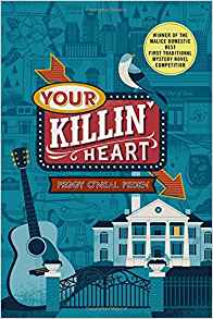
Fun new mystery series set in Nashville and highlighting Country Music

Your Killin’ Heart: A Mystery (Nashville Mystery)

By: Peggy O’Neal Peden

Rating: 5 of 5

yourkillinheart“Your Killin’ Heart” was a fun and fast mystery read. It is set in Nashville and has country music as its basis. Campbell Hall has a travel agency that takes up much of her time. When she’s not at work, she loves to listen to live music (mostly country) and lives in a city, Nashville, that is known for exactly her type of live music.

Continue reading

Posted in Mystery/Suspense/Thriller | Leave a comment

46 Fantastic Eragon (Inheritance) designs by Ciruelo designs printed one side of the book

The Official Eragon Coloring Book (The Inheritance Cycle)

By: Christopher Paolini

Rating: 5 of 5

Attached to this review will be a silent flip-through of the entire coloring book and some sample photos so you can make an informed decision as to whether or not it will work for you.

The 46 designs (not including the title page) in this coloring book are based on the entire Inheritance Cycle. The illustrations by Ciruelo are fantastic and provide a new visual interpretation of the stories. Just looking at the designs brought back the fun I had when I first read Eragon. My husband, youngest daughter and I tried to take turns reading it but in the end, we each got our own copies as we couldn’t wait.
We are also all getting our own copies of this coloring book as well. It is great fun to see how each of us interprets a design in our own way. The designs are detailed and some contain small and intricate areas to color.
The 46 designs are based four books: Eragon, Eldest, Brisingr, and Inheritance. There is a quote from the book on the facing page of design so you know which book and which scene the design pertains to.
This is what I found while coloring in this book and testing the paper with my coloring medium.
46 designs by Ciruelo based on the Inheritance Cycle by Christopher Paolini
Printed one side of page (with book excerpts on the back of the page)
Paper is heavy weight, white, ever so slightly rough and perforated
Glue Binding
Designs stop well short of the perforations. There is a double framing line around the edges of each design.
Alcohol-based markers bleed through this paper
Water-based markers, gel pens, and India ink pens did not bleed through the paper. Some gel pens require additional drying time.
Colored pencils worked really well with the paper. The slightly rough texture of the paper provided good tooth which allowed pigment to easily adhere to the page. I test both oil and wax based pencils and both worked well. I could layer the same color for deeper pigment, layer multiple colors and blend easily using a pencil style blender stick.
If I use alcohol-based markers with this style of book (printed one side of page) but I use a blotter page of card stock under my working page to keep ink from seeping through. I would suggest either using a blotter page or removing the coloring page from the book beforehand if you use alcohol-based markers.

Posted in Adult Color Books | Leave a comment

47 Great Downton Abbey designs designs printed one side of the book

Downton Abbey Coloring Book

By: Gwen Burns

Rating: 5 of 5

Attached to this review will be a silent flip-through of the entire coloring book and some sample photos so you can make an informed decision as to whether or not it will work for you.

I really am enjoying the Downton Abbey coloring book. It was and still is one of my favorite series. The designs look like the characters, so it is easy to see that my favorites are all included.
The designs are spread across all seasons of the series with a good selection of characters. There is a quote from the series on the facing page of design which gives context to the design (though they don’t always match up with the actual character such as the quote from Mrs. Patmore about toasters and mixers with the picture of Daisy using a hand mixer.
The designs are detailed and some contain intricate and small areas to color. For the most part, you won’t need special ultra-fine pens/markers to color these designs.
This is what I found while coloring in this book and testing the paper with my coloring medium.
47 designs (including title page) based on the Downton Abbey television series
Printed one side of page (with quotes from the show on the back of the page)
Paper is heavy weight, white, slightly rough, and non-perforated
Hybrid Sewn and Glue Binding (lots of little stitches that cannot be snipped to remove pages.)
Designs merge into the binding. Nothing essential will be lost if you carefully cut the pages close to the binding to remove. I prefer to keep the book together to keep the continuity of the quote with the design.
Alcohol-based markers bleed through this paper
Water-based markers, gel pens, and India ink pens did not bleed through the paper. Some gel pens require additional drying time.
Colored pencils worked really well with the paper. The slightly rough texture of the paper provided good tooth which allowed pigment to easily adhere to the page. I test both oil and wax based pencils and both worked well. I could layer the same color for deeper pigment, layer multiple colors and blend easily using a pencil style blender stick.
If I use alcohol-based markers with this style of book (printed one side of page) but I use a blotter page of card stock under my working page to keep ink from seeping through. I would suggest either using a blotter page or removing the coloring page from the book beforehand if you use alcohol-based markers.

Posted in Adult Color Books | Leave a comment

46 Beautifully illustrated designs based on the Court of Thorns and Roses series designs printed one side of the book

A Court of Thorns and Roses Coloring Book

By: Sarah J. Maas

Rating: 5 of 5

Attached to this review will be a silent flip-through of the entire coloring book and some sample photos so you can make an informed decision as to whether or not it will work for you.

I am really happy with this coloring book (as I was with the book based on Sarah J. Maas Throne of Glass” series.) The designs are beautifully done by a team of illustrators (Charlie Bowater, Adrian Dadich, Yvonne Gilbert, John Howe, and Craig Phillips.) While their styles differ and once again one artist in particular is quite different in style, each artist is tasked with a series of illustrations which brings a sense of cohesion to the whole book.
The 46 designs are based on the three books: Court of Thorns and Roses, Court of Mist and Fury and Court of Wings and Ruin. There is a quote from the book on the facing page of design so you know which book and which scene the design pertains to.
This is what I found while coloring in this book and testing the paper with my coloring medium.
46 A Court of Thorns and Roses Designs by five artists
Printed one side of page (with book excerpts on the back of the page)
Paper is heavy weight, white, ever so slightly rough, and perforated
Sewn binding
Designs are printed beyond the perforations and merge into the binding. Nothing essential will be lost if you remove pages at the perforations.
Alcohol-based markers bleed through this paper
Water-based markers, gel pens, and India ink pens did not bleed through the paper. Some gel pens require additional drying time.
Colored pencils worked really well with the paper. The slightly rough texture of the paper provided good tooth which allowed pigment to easily adhere to the page. I test both oil and wax based pencils and both worked well. I could layer the same color for deeper pigment, layer multiple colors and blend easily using a pencil style blender stick.
If I use alcohol-based markers with this style of book (printed one side of page) but I use a blotter page of card stock under my working page to keep ink from seeping through. I would suggest either using a blotter page or removing the coloring page from the book beforehand if you use alcohol-based markers.

Posted in Adult Color Books | Leave a comment

Great coloring book based on the characters of the Discworld series printed both sides of the page

Terry Pratchett’s Discworld Coloring Book

By: Terry Pratchett

Rating: 5 of 5

My husband and I have enjoyed the late Terry Pratchett’s Discworld novels over the years and were very happy to find a coloring book based on those books. The illustrator is Paul Kidby whose portfolio, The Art of Discworld, is a fantastic collection of artwork based on the series. The designs in this coloring book are based on that portfolio.

There many characters and bits and pieces of various stories spread throughout. The designs are quite detailed and some have intricate and small areas to color. In addition to the line drawings, there are 16 pages of original artwork to guide your color choices if you wish to remain true to the original. Even if you go your own way with color, it is fun to have the artwork to look at (or remove if you wish as the pages are perforated.
My only small nit with the book (besides it being printed on both sides of the page) is that the two page spread designs have a white strip between the pages. In one way, I like it (as I don’t have to color into the binding. On the other hand, it does create a design that is not connected and, in my copy, there is a slight duplication of the images on both sides of the page closest to the binding. This doesn’t trouble me too much but I did want to mention that it exists.
This is what I found while coloring in this book and testing it with my coloring medium.
77 coloring book design pages based on the Discworld series and its characters. There are an addition 16 full color pictures of some of the original drawings of the designs included in the book.
Printed on both sides of the page; while most design are contained on one page there are a handful of two-page spread designs
Paper is heavyweight, white, lightly rough, and perforated
Sewn binding with perforated pages
Many designs cross over the perforations but stop short of merging into the binding. This is true of the two-page spread with results with a white strip down the middle of the two pages.
Alcohol-based markers bleed through the page. If you use these, you will have ink seep through and mar the design on the back of the page.
Water-based markers, gel pens and India ink pens do not bleed through the page.
Colored pencils work well with the paper. I was able to blend, layer the same and multiple colors using both oil and wax-based pencils with ease.

Posted in Adult Color Books | Leave a comment

Extremely intricate floral designs based on flowers through the year printed both sides of the page

The Flower Year: A Coloring Book

By: Leila Duly

Rating: 4 of 5

I will attach a silent, full book video flip-through (as well as a few photos) so you can decide for yourself if this book will work for you.

I must admit that my first feelings upon opening this book were of disappointment. I had expected this book to be in the same format as Leila Duly’s first book and was surprised and unhappy to see the new format.
The first book was printed in large format, single sided and on heavy card stock. This book is printed in a smaller than average format, printed on both sides of the page and the paper is considerably lighter in weight (medium/heavyweight paper rather than card stock.)
After getting over both my initial feelings and just myself in general, I looked again at the book and realized that while it was not published as fantastically as the first book, it is still a very well done book compared to most coloring books out there.
My only real problem with the book, and the reason I detracted a star, is that many of designs are so scaled down in size to fit the smaller format that it is difficult to color in the tiny spaces. The book is both detailed and intricate in scope, I cannot recommend it to anyone with fine motor or vision issues.
While those are not issues for me, finding coloring medium that works with the book requires using ultra-fine, micro-point and extremely sharp nib medium. I choose to use coloring pencils sharpened to a very fine point. I may use my Tombows and other watercolor brushes and markers as well as they did not leak through the page (see below.)
The designs are set up as a calendar of sorts of flowers which are in bloom during each month of the year. The names are generally included on the each design and there is a thumbnail listing of the designs (and flowers therein) at the end of the book.
I am also in hopes that the publisher, Laurence King Publishing, will come out with an artists edition of this book as they did with Johanna Basford when she was with this publisher. If so, I hope that they concentrate on the two-page spread designs and enlarge them for ease of coloring rather than printing large versions of the single flower designs. Ms. Duly’s first book was in the format of an artists edition, so I think there is hope that it will happen.
This is what I found while coloring in this book and testing it with my coloring medium.
95 flower designs as shown throughout the year. Some of these are elaborate and intricate while others are small designs to fill in a page of quotations.
Printed on both sides of the page. There is a mix single page designs and designs that spread across two pages
Paper is heavyweight, ivory color, lightly rough, and non-perforated
Sewn binding which can be snipped to release several pages at a time. I prefer to keep my book intact as a calendar of flowers throughout the year.
Book is smaller than average (approximately 7 x 9 inches) with a hard back cover and an attached fabric ribbon bookmark.
Alcohol-based markers bleed through the page. If you use these, you will have ink seep through and mar the design on the back of the page.
Water-based markers, gel pens and India ink pens do not bleed through the page.
Colored pencils work well with the slightly rough paper. I was able to blend, layer the same and multiple colors using both oil and wax-based pencils with ease.

Posted in Adult Color Books | Leave a comment

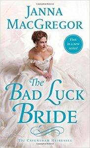
Good debut and start to a new series

The Bad Luck Bride (The Cavensham Heiresses)

By: Janna MacGregor

Rating: 4 of 5

thebadluckbride“The Bad Luck Bride” is the start of a new series with another book on its way in November. This book is the story of Claire and Alex.

Claire has suffered traumatic events in her early life that have left her with some serious emotional issues. She is deathly afraid of crossing over rivers in a coach and even more so of thunderstorms.

Continue reading

Posted in Romance | Leave a comment

A Third Tale of the Beautiful Fantasy land of Cocot printed on both sides of the page

Romantic Country: The Third Tale: A Fantasy Coloring Book

By: Eriy

Rating: 5 of 5

I so enjoy this series of coloring books. I love that it is the continuing story of a fantasy land (Cocot) and Elena (the little girl) and her duck Joset. Each of the books is better than the last. In this story, along with illustrations of the land, some holidays (such as Christmas and Halloween) are represented. The book expands the nature of the fantasy land and makes for a cohesive series. That the artist’s work is beautiful and imaginative adds even more.

The artist, Eriy, has created her beautiful artwork using ink and a toothpick (lovely story in the first book explains she forgot to get a pen and made do with what she had on hand toothpicks!) Because of this technique, the lines of the drawings have a varying thickness and the print is lighter in tone than in other coloring books.
Once again, there is a map at the front of the book which shows all of the landmarks. There are thumbnails at the end of the book which explain each of the designs and what and where they are in Cocot. There is also a 3D pop-up card at the end of the book. You have to cut it out and color it but thankfully, there are good instructions for the how-to end of it.
The book is divided into five chapters: Chapter 1: Peaceful days in the North, Chapter 2: Peaceful days in the South, Chapter 3: Beautiful island scenes, Chapter 4: Good times for Elena and Joset, and Chapter 5: The passage of time in the Secret Forest. There are 64 designs (not including chapter heading illustrations, front pages and maps.) Of these, 16 are spread across two pages. The illustrations within each chapter relates to the subject matter of that chapter.
Each of the chapter heading pages includes a lovely two-page spread designs. There are a couple of designs at the front of the book which sit outside of the chapters. These designs are not included in the thumbnails at the back of the book.
The book has a brown kraft paper style attached cover. This cover has line drawings on front and back covers which you can color if you wish. The detached dustcover is beautifully illustrated with colorful designs of Cocot. The inside of the dustcover is white.
This is what I found when I was coloring in this book and testing the paper with my coloring medium.
64 Beautiful designs set in the fantasy land of Cocot. There are 16 two-page designs spreads. There are additional map and chapter heading illustrations and other bonus images to color.
Designs are printed on both sides of the page
Paper is cream colored, heavyweight, smooth and non-perforated.
Sewn Binding
Designs merge into the binding area and two-page spreads cross over the binding as well.
The book opens fairly flat for coloring but a little effort is needed to color into the binding edge
Alcohol-based markers bleed through this paper. I don’t suggest this medium as it will ruin the design on the back of the page. If you decide to use this style of markers, I suggest a blotter page of card stock or a couple of pages of heavyweight paper under your working page to keep ink from seeping further in to the book.
Water-based markers and India ink pens left slight shadows on the back of the page. I could see them and it bothered me enough not to want to use these for coloring my designs.
Gel pens did not bleed through but required additional drying time.
Colored pencils worked fairly well with this paper. I tested both oil and wax based pencils and had a little trouble blending with both. Due to the smooth texture of the paper, when I used a blending stick, there was a slight amount of smear versus blend. I found that wet blending medium worked better for me. Otherwise, colored pencils worked well. Pigment went on deep and thick and I was able to easily layer multiple colors.

Posted in Adult Color Books | Leave a comment