June 2026 S M T W T F S « Feb 1 2 3 4 5 6 7 8 9 10 11 12 13 14 15 16 17 18 19 20 21 22 23 24 25 26 27 28 29 30 Search
Reviews by Category
-
Recent Posts
Archives
- February 2022 (1)
- January 2022 (2)
- December 2021 (2)
- November 2021 (5)
- October 2021 (4)
- September 2021 (4)
- August 2021 (5)
- July 2021 (4)
- June 2021 (6)
- May 2021 (5)
- April 2021 (4)
- March 2021 (5)
- February 2021 (5)
- January 2021 (5)
- December 2020 (5)
- November 2020 (5)
- October 2020 (9)
- September 2020 (8)
- August 2020 (6)
- July 2020 (7)
- June 2020 (11)
- May 2020 (6)
- April 2020 (8)
- March 2020 (5)
- February 2020 (8)
- January 2020 (5)
- December 2019 (8)
- November 2019 (6)
- October 2019 (11)
- September 2019 (11)
- August 2019 (8)
- July 2019 (12)
- June 2019 (10)
- May 2019 (8)
- April 2019 (5)
- March 2019 (4)
- February 2019 (4)
- January 2019 (4)
- December 2018 (16)
- November 2018 (20)
- October 2018 (25)
- September 2018 (20)
- August 2018 (26)
- July 2018 (25)
- June 2018 (23)
- May 2018 (25)
- April 2018 (28)
- March 2018 (24)
- February 2018 (23)
- January 2018 (26)
- December 2017 (12)
- November 2017 (10)
- October 2017 (37)
- September 2017 (48)
- August 2017 (19)
- July 2017 (30)
- June 2017 (30)
- May 2017 (44)
- April 2017 (32)
- March 2017 (49)
- February 2017 (32)
- January 2017 (54)
- December 2016 (29)
- November 2016 (36)
- October 2016 (39)
- September 2016 (31)
- August 2016 (49)
- July 2016 (64)
- June 2016 (52)
- May 2016 (52)
- April 2016 (66)
- March 2016 (72)
- February 2016 (60)
- January 2016 (59)
- December 2015 (72)
- November 2015 (81)
- October 2015 (59)
- September 2015 (41)
- August 2015 (33)
- July 2015 (30)
- June 2015 (25)
- May 2015 (42)
- April 2015 (40)
- March 2015 (32)
- February 2015 (25)
-
Net Galley
Author Archives: Iiiireader
32 Winter and Holiday Inspired Intricate and Detailed Designs 22 Large and 10 Medium size printed on one side of the page
Hello Angel Winter Wonderland Coloring Collection (Hello Angel Coloring Collection)
By: Angelea Van Dam
Rating: 4 of 5
As a quick note, the cover of the book currently showing on Amazon (skater’s boots) is not the cover of the book I received. My cover (as seen in my video) has a montage of skates, gloves, and scarves. It is the same book but obviously the cover on Amazon was a concept photo and not what was actually used in publishing. Both designs are in the book in the smaller, medium size format.
Once again, I love the designs in this book but am less than pleased with the face that the publisher is printing 10 of the designs in less than full size. Admittedly, in this book, they have shrunk the designs less than in others but I wish that they would go back to all full size designs. They have included a thumbnail color sample and some sample colors used in their design for inspiration. It takes up the bottom 1 inches of the page. In the last few book I purchased, it took up a full 3 inches of the page. This information could be printed on a separate page or on the actual color sample page rather than on the coloring page. Because of the shrinking of the designs, I have detracted a star from my rating of this book.
In this book, it makes a big difference. Hello Angel books have intricate and detailed designs. By shrinking them down, it takes them from slightly difficult to challenging. I can’t recommend this book for anyone with vision or fine motor issues because of the complexity of the designs and especially for the tiny size of the designs elements.
The designs are really beautiful. They speak to both winter and to the holiday season. I really appreciate the level of detail this designer has put into her work. I like using colored pencils with really sharp points because of the tiny spaces but it is fun and something that I enjoy. The smaller designs are much more difficult to deal with but, for me, there is a way around it but it is at an additional cost.
A good number of the designs in this book (including those that were reduced in size) are available in full size in two of Design Originals anthology Christmas coloring books this year: Deck and Halls and Merry and Bright. I own all three books and it doesn’t bother me to have the duplications as buying the three books gave me most of the full size designs I wished for in this book.
This is what I found while coloring in this book and testing the paper with my coloring medium. In the comments section below, I will list the coloring medium I use for testing and coloring.
32 Intricate and Detailed Winter inspired designs 22 Full Size and 10 Medium Size
Printed one side of the page back of page has a softly colored design, journal lines and a quote appropriate to the subject of the coloring book
Paper is medium weight, white, slightly rough and perforated
Glue Binding
Designs stop well before the perforations
Alcohol-based markers bleed through the page quickly.
Water-based markers bleed through the page in heavy spots.
Gel pens and India ink pens can spot through to the back of the page
Colored pencils work well with the paper. Both oil and wax based pencils provide good color, layer, and blend well. Hard lead pencils can dent through the page.
I use a blotter page of card stock or heavyweight paper (two sheets0 to keep seeping ink and dents from marring the pages below. I recommend using a blotter or that you remove pages before coloring.
Posted in Adult Color Books
Leave a comment
Exciting and fun beginning to a new mystery series
Counterfeit Conspiracies (A Bodies of Art Mystery Book 1)
By: Ritter Ames
Rating: 4 of 5
 This is the first book I have read by Ritter Ames and it is the first in a series of books about recovering artworks.
In this story, Laurel Beacham is the sleuth who ferrets out artworks that have been misappropriated in the past. She likewise re-appropriates them (by hook or by crook) and restores them to their rightful owners. She has an uncanny ability to change her appearance and demeanor and has, up until now, not been found out.
Laurel finds herself looking not only for artwork but for her co-worker as well. Her past relationship with the man gives her an extra motivation as well as knowledge of where to look for him. She runs into a new individual and has to decide whether to trust him or consider him part of the plot that has taken her friend.
The book is both funny and has a lot of roller-coaster style thrills. I had a lot of fun reading the book and look forward to more in the series in the future.
I was provided a digital advance reader copy of this book by the publisher, Henery Press, via Netgalley.
Posted in Mystery/Suspense/Thriller
Leave a comment
Interesting and Action-filled transitional book in a three part series within a series
Hide Away: An Eve Duncan Novel
By: Iris Johansen
Rating: 4 of 5
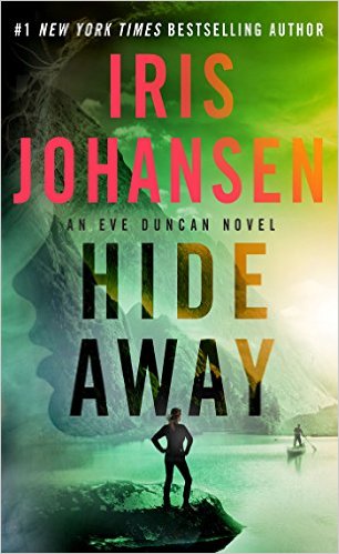 I read this series out of order by reading the 19th and the 21st books before reading this, the 20th book in the Eve Duncan series. I thought that I had not missed much but once I went back and read through “Hide Away”, I realized that it was filled with pivotal information that transitioned the series. I highly suggest that you read these three books in their intended order.
Posted in Mystery/Suspense/Thriller
Leave a comment
20 Laurel Burch Design Postcards designs printed on one side of perforated card stock
The Art of Laurel BurchTM Coloring Postcard Book: 20 Iconic Designs
By: Laurel Burch
Rating: 4 of 5
The Art of Laurel Burch Postcard Book is a set of various designs by the late Laurel Burch. I have enjoyed many of her designs in household and wearable goods over the years. Earlier this year, I purchased a coloring book of her designs and was really pleased to pick up this set of postcards as well.
Many of her design themes are included including cats, dogs, horses, and others. As with the coloring book, there weren’t any mermaids which is something that I wish it had. I can only hope that there will be other books or cards in the future with some of the ocean designs in it.
Usually, postcards have a glue binding similar to notepads but in this case, each of the cards is perforated for easy removal from the set. However, this method leaves a rough edge on the perforated side. I much prefer the standard glue binding of other postcard sets as the rough edge gives a really unfinished look to the whole project. The address area is set up for postcard mailing and includes a small thumbnail design which can also be colored.
The cover of the set is done with a beautiful glossy rendition of Ms. Burch’s artwork with elements picked out in gold foil. The set is printed on a medium weight card stock rather than some of the heavyweight card stock I have on other postcard sets.
I found that only alcohol-based markers bled through the paper. Water-based markers, gel pens, and India ink pens did not bleed through. Colored pencils (both oil and wax-based) did well with layering and blending and did not dent through the page.
Posted in Adult Color Books
Leave a comment
Wonderful Grayscale Coloring book with lots of detail printed on both sides of the page
Colin Thompsons Fantastisches Malbuch
By: ?
Rating: 5 of 5
I have several Ravensburger puzzles by Colin Thompson and enjoy the unusual subjects and intricacies of those. When I saw this coloring book was available albeit in German, I purchased it immediately and then had the long wait for it to be shipped from Europe.
The designs are the same wild and imaginative ones that I have seen in my puzzles just in grayscale rather than in color. Coloring in this book is both a joy and an endeavor as there is simply so much to each and every design. For my first project, I used almost all 120 colors of polychromos and had a blast with it. For some people, the book may seem physically darker than expected but I was able to use grayscale techniques with results that were pleasing to me.
I was pleasantly surprised to see that the only the outside and inside of the cover is in German. The designs themselves include English. The designs are done in grayscale have have extremes of both white and black as part of the designs.
The designs are printed on both sides of the page and are mostly spread across two pages with the designs merging up to the binding. I have found that the designs in my book line up well and I didn’t lose any portion of the design into the actual binding area itself. The binding is sewn rather than glued which really helps when I am coloring. I find that sewn bindings are easier it get to lay flat so I can get my pencils in to the parts closest to the fold.
The non-perforated paper is a nice white heavyweight and is ever so slightly rough which gives great tooth for gripping pigment from colored pencils. When I tested my pencils (both wax and oil based), I was able to get great pigment, to layer the same color for deeper tones, layer multiple colors, and to blend easily using my blender stick.
Alcohol and water-based markers all bled through the paper to some degree. India ink pens spotted through to the back of the page. My gel pens did not bleed through but some of the darker colors left an indistinct shadow on the back of the page. I found that colored pencils worked the best and will be what I use in this book exclusively.
Posted in Adult Color Books
Leave a comment
78 Pages of Fantastic Beast Designs with Focus on Magical Characters and Places printed both sides of page
Fantastic Beasts and Where to Find Them: Magical Characters and Places Coloring Book
By: HarperCollins Publishers
Rating: 5 of 5
Attached to this review will be a silent flip-through of the entire coloring book so you can make an informed decision as to whether or not it will work for you.
While I (as many others) am eagerly awaiting the release of the movie on which this coloring book is based, I was really pleased to get this book ahead of the movie release. It gives a sense of the vibe of the movie and also allows my imagination to run full rein as, apart from a few clips on-line and the pictures on the inside of the front and back page, I don’t have preconceived notions of what something should look like.
The book is well made and the designs are well done. I appreciate having the handful of small colored pictures (rather than pages of them.) The scenes are set in New York in the 1926. It is an interesting time period as the excess of the roaring 20’s was still in place but, historically speaking, there were foreshadowing of the Great Depression already in place.
The designs are detailed for the most part (though some of the character designs are quite open and free of details.) There are a few designs that have intricate and small areas to color. I’ve already started my first two projects in the book and am looking forward to coloring through the pictures (probably before the movie is released) and will certainly be waiting for the next coloring books in the series to be released.
This is what I found while coloring in this book and testing the paper with my various coloring medium. In the comments section below, I will list the coloring medium I use for testing and for most of my coloring projects:
78 Pages of Fantastic Beasts Designs based on the movie
Printed on both sides of the page
Paper is heavyweight, white, slightly smooth and non-perforated
Binding is hybrid glue/sewn. If you wish to remove pages, you will have to cut them out. I do not plan on doing so as so much important detail will be lost.
Designs merge into the binding area
Many designs spread across two pages. On my copy, the pages line up well.
Book can be opened fairly flat for coloring by breaking the spine, though it is still difficult to color into the binding area
Alcohol-based markers bleed through this paper rapidly. If you use this medium, you will definitely mar the design on the back of the page.
Water-based markers did not bleed through; however, Stabilo 88 and Staedler fineliners left the faintest of shadows on the back of the page.
Gel pens and India ink pens did not bleed through or leave shadows. Some gel pens required additional drying time.
Colored pencils worked well with this paper. I got fairly good pigment from both oil and wax-based pencils. Layering the same color for deeper pigment worked well as well as layering multiple colors. Blending with a pencil style blending stick worked pretty well though my Tombow Irojiten did not blend as well as my other pencils (perhaps due to their hardness.)
Posted in Adult Color Books
Leave a comment
25 x 2 Gothic and Halloween Inspired Designs by Selina Fenech printed one side of page
Night Magic – Gothic and Halloween Coloring Book (Fantasy Coloring by Selina) (Volume 10)
By: Selina Fenech
Rating: 5 of 5
I own a number of Selina Fenech’s coloring books so I am very familiar with her elegant artwork. I also really enjoy Halloween inspired designs and am always looking for new books to add to my collection (especially as there have been very few published compared to other genres.) In Night Magic, Ms. Fenech has provided a number of lovely witches along with Gothic style designs. I would not categorize the book as a Halloween book but rather one that includes Halloween designs.
The designs are detailed and I find them fairly easy to color. While some designs have small details, the designs are not generally intricate with tiny details that are hard to color. I like to work first with my markers and then with my colored pencils as I find that that is the process that works best for me with Ms. Fenech’s coloring books.
Two things I really appreciate about the book are that you get two copies of each design. That makes it easy to share or to try two different colorways or mediums. The second thing I really like is that almost all of the designs have framing lines around them. It gives me a natural stopping point which gives a more finished look at the end and it also saves me ink/pencil as I dont’ have to color to all the edges.
This is what I experienced while coloring in this book and testing my coloring medium on the paper:
25 x 2 Gothic and Halloween-inspired designs
Printed one side of the page
Paper is white, thin, slightly rough and non-perforated
Designs do not merge into the binding and there is plenty of room to cut out pages if you choose to do so. Most designs have a framing line around the outer edge
Glue Binding
Alcohol-based markers bleed through the page quickly.
Water-based markers bleed through in spots.
Gel pens and India ink pens leave shadows on back of the page. India ink can bleed through if you apply heavily or multiple coats.
Coloring Pencils work well with this paper. I found that I could layers the same color for deeper pigment or multiple colors and I could blend easily using a pencils style blending stick. Both wax and oil based pencils worked well with the paper. Hard lead pencils can leave dents through the page.
I like to use a blotter when working in the book. I use a page of card stock or several sheets of heavyweight paper under my working page. It keeps seeping ink and marring dents from ruining the pages below.
Posted in Adult Color Books
Leave a comment
20 Lovely Postcard Designs by Hanna Karlzon printed one side of the card stock with address/stamp area on back
By: Hanna Karlzon
Rating: 5 of 5
I recently discovered Hanna Karlzon’s amazing coloring books and have purchased those that are currently available. While I am enjoying using colored pencils in her regular coloring books, I have not been able to use the alcohol-based markers I so enjoy. These postcards are printed essentially one-sided so I purchased this set which will allow me to use my markers without damaging a design on the back of the page.
I am really enjoying Ms Karlzon’s imaginative world of flowers, birds, insects and animals that inhabit the pages of these postcards. I hope she considers doing another set of postcards which include some of the lovely people that inhabit her books as well.
While a few of the postcards in this set are sized down from the original designs in the coloring book by the same name (Daydreams) most are cropped down to fit the postcard format rather than reduced in size. That makes it much easier to color without having to resort to smaller size nibs. In the first designs I did in this set, I used alcohol-based markers such as fine and ultra-fine nib Sharpies, Bic Mark-its and the brush end of Copic markers.
This is what I experienced while coloring these postcards and testing the paper with my coloring medium.
20 Daydream designs sized for postcard format with mailing areas defined on the back of the card
Printed on one side of the card
Paper is heavyweight card stock in smooth ivory
Glue bound but in the style of easy to remove pages such as a notepad
Alcohol-based markers left colorful shadows on the back of the page and only one had the tiniest bit of spot through. I would put a blotter page of paper under my working page or remove the card from the book to color to keep the designs below safe from the slight possibility of seeping ink
Water-based markers, India ink, and gel pens did not bleed through the card. Gel pens took a little longer to dry than usual.
Colored pencils worked well with this paper. Oil and wax-based pencils worked well with good color, layering, and blending using a pencil style blending stick.
Posted in Adult Color Books
Leave a comment
Beautiful Third Coloring Book by Daria Song plus comparison to Thailand version printed on both sides of page
The Night Voyage: A Magical Adventure and Coloring Book (Time Adult Coloring Books)
By: Daria Song
Rating: 5 of 5
I was so looking forward to this coloring book that I also purchased the version printed in Thailand. While I like things about both versions, for me, the US version is the clear winner. Why? Simply put it has more designs to color. I’ll go into some of the differences at toward the end of this review.
The Night Voyage is the story of a young girl and her cat, Phoebe, who go on a night adventure giving away presents to others. Or did they? That is the question left unanswered at the end of this story.
The coloring book is filled with Daria Song’s beautiful artwork and imaginative design concepts. From paper crane airplanes to old-fashioned bicycles to gorgeous air balloons, each page is a wonderful opportunity to color.
In addition to the 64 pages of designs, there are thumbnails of each and a bonus coloring page as well as a card that can be cut out and colored. (with both cutting lines and folding line included.)
This is what I experienced while coloring in this book and testing the page with my coloring medium. In the comments section below, I will list the coloring medium I use for testing and coloring.
64 pages of Daria Song designs plus bonus page and card
Printed on both sides of the page
Paper is bright white, very lightly rough, heavyweight and non-perforated
Binding is both glued and sewn not the type that is easy to snip threads to remove pages. I don’t recommend this as so many of the designs spread across two pages
Designs merge into the binding area
Most designs spread across two pages
Separate dust cover which has coloring opportunities on the inside and an attached cover which can be colored as well.
Alcohol-based markers bleed through this paper
Water-based markers, gel pens and India ink pens do not bleed through and do not leave shadows on the back of the page. Some gel pens require additional drying time.
Colored pencils worked very well with this paper. I tested oil and wax based pencils. I was able to get good pigment lay down with both types. Layering the same color for deeper color, multiple colors and blending with a blending stick worked well and easily.
US versus Thailand printing:
Both versions have their advantages. The Thailand version was printed on a slightly off white when compared to the US one (thought I originally thought of it was simply white.) It also had colored images and colored cards included with some single page versions of designs which were on two-pages spreads. You can see my review and video of this version from May of this year on Amazon under the name The Present by Daria Song.
For me, the US version was the better of the two but I am happy that I have both. The US version is printed on bright white paper that was able to take all but alcohol-based markers without showing through. There are many pages of designs not included in the Thailand version at all. The detached dust cover, which is different from the original two books by Ms. Song, was a nice new touch with coloring opportunities as well. While the books are approximately the same size and the US version actually has less pages overall, it weighs more which leads me to believe that the paper is thicker.
Posted in Adult Color Books
Leave a comment
Great Pop Fashions from the 1960s Coloring Book printed both sides of page
Vogue Goes Pop: Coloring Book
By: British VOGUE
Rating: 5 of 5
The Pop culture fashion of the 1960’s is the theme for this Vogue coloring book. Iain R. Webb is the illustrator for this book as he was for the prior Vogue coloring book. He does a lovely job of interpreting the actual fashions of the time into line drawings. Along with each fashion is a particulars of the fashion, the designer as well as odd bits of info (such as how it could be ordered, etc.) This information is generally off to the side of one of the fashion designs. The designs range from fairly simple lines to highly detailed with small intricate parts to color.
The fashions of the 1960’s showed a jump from the cute matching outfits with gloves to wild colored mini-skirts and men’s ware for women all the way to the hippie-inspired caftans that were popular as the decade wound to an end. A number of the models have a Twiggy quality to them, with thin almost young boy figures with eyes with heavy fake eyelashes.
While my preferences in fashion coloring books are from the decades before the pop culture period, I appreciate the fashions that I recall seeing when I was a little girl. As an adult, I now appreciate how the fashions of this period reflected the social changes which were occurring at the time. Women were becoming more free to express themselves and to show the expression in how they dressed.
The one issue I had with the prior book is much better in this one. I did not like the squiggly lines that were placed on the models mouths as I prefer to color the lips in my coloring projects my own way. The few that do appear have more of a highlight look to them rather than the caterpillar look I found in the first book.
This is what I found as I colored in this book and tested the paper with my coloring medium. In the comments section below, I will list the coloring medium I used for testing and for coloring.
93 pages of Fashion Designs from the Pop Culture Period
Printed on both sides of the page
Paper is heavyweight, white, smooth and non-perforated
Sewn Binding (you can snip a few threads to remove a few pages at a time if you wish.)
Designs do not merge into the binding area and do not spread across two pages
Coloring book can be opened to fairly flat for coloring by breaking the spine with some effort.
Alcohol-based markers bleed through this paper
Water-based markers, gel pens, and India ink pens do not bleed through and did not leave shadows on the back of the page.
Colored pencils worked well for the most part. I could get good pigment color and layer the same or multiple colors easily. Blending with a blending stick sometimes resulted in a slightly smeary look rather than a clean blend. Using a liquid blender worked better for me. I tested both oil and wax based pencils with similar results.
Posted in Adult Color Books
Leave a comment