My comparison of the US version of this book compared to the UK version will be towards the bottom of this review.
I really like the designs in this coloring book. Each of the Dr. Who’s are represented in the book and are shown in an interesting silhouette style design with their heads literally filled with pertinent elements from their time as Dr. Who. There is a similar one for Missy as well. I took the time today to finish my personal favorite, the Tenth Doctor Who and the Tardis in Time and Space. The designs are well drawn with good black lines. Some designs are fairly open and easy to color while others are more intricate and will be a little more challenging but still a lot of fun.
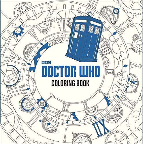
The book is well made. The designs are printed on one side of an off-white colored non-perforated paper. The paper has a very smooth, almost slick feel to it. On the back of each page is a thumbnail version of the design along with a quote that is applicable to the design and which Dr. Who it pertains to as well as the name of the episode and the year it was filmed. The cream colored cover can be colored as well and has lovely deep blue foil touches to make it look extra special.
The publisher missed an opportunity by not providing designs on the inside of the fold-out, attached cover; however, there are two flaps you can color if you wish where the printing is white on blue background. The binding is sewn rather than glued, so removing pages is a matter of snipping threads. While a good number of designs merge into the binding, it will not matter if you remove the page by cutting the threads as you will retain the entire page. If you decide to cut the page out instead, you may lose portions of those designs.
Only my alcohol-based markers bled through to the back of the page. My water-based markers left a shadow of color on the back of the page. My gel pens and India ink artist pens did not bled through the paper. My gel pens required extra drying time. My colored pencils all worked well on the surface of the paper and behaved as expected for the type of lead with soft lead going on thick and blending extremely well. I would recommend putting a blotter page of some sort – chipboard, card stock, etc. under the page you are working on to keep ink from possibly getting on the following pages.
These are the coloring medium that I use for testing. If there is something else you feel I should be testing, please let me know and I will see if I can add it to my growing pile:
Markers: 1) alcohol-based – Copic Sketch, Prismacolor double ended markers (brush and fine point), Sharpies (fine and ultra-fine) Bic Mark-its (fine and ultra-fine) and 2) water-based – Tombows dual end markers (brush and fine point), Stabilo 88, and Staedler triplus fineliners
India Ink: Faber-Castell PITT artist pens (brush tip)
Gel Pens: Sakura, Fiskars, Uni-ball Signo in the following sizes – 0.28/0.38/0.5/1.0 and Tekwriter
Coloring Pencils: Prismacolor Premier Soft Core, Derwent Colorsoft, Prismacolor Verithins, and Faber-Castell Polychromos
I ordered and received the UK version of this coloring book late last year. When I order more than one version, I try to do a comparison for others to benefit from. In some cases (like “Animorphia” and “Lost Ocean”) there are distinct differences. In the case of Dr. Who, the differences are more subtle. The books weight the same at 1.07 pounds. That tells me that the same grade of paper was used. The covers are different colors (UK is white with cyan foil and the US is cream with deep blue foil.) The books are bound the same and the same images appear in both book. The books are the same height, depth and width. The pages of the books are a different color. The pages in the UK book are a true cream color. The US version is more of an antique white – with beige tones rather than cream. The designs are printed more distinctly on the UK version and in a side by side comparison, the US version seems a little less distinct. My coloring mediums worked the same with both books. If my photos post, the US version is at the top and the UK version is at the bottom.
In summary, I really like this book as a colorist. I find that I prefer the page color and ink of the UK version but if I had never seen it, I would have been completely happy with the US version. Getting two copies works well for my house as my husband wants one of his own. The subject matter of the coloring book is for a show that I have enjoyed for many years and I will be having a lot of fun with it. While the paper could have been improved and perforated pages would be appreciated, I didn’t detract for those because the way the book was published made it less essential and more of a preference for my use of the book.
 My comparison of the US version of this book compared to the UK version will be towards the bottom of this review.