Rise and Shine: Inspirational Adult Coloring Book (Majestic Expressions)
By: Majestic Expressions
Rating: 5 of 5
This is a Christian-based coloring book which celebrates joy in life. The artwork is collaboration by three different illustrators: Erin Jons, Ember Canada and Chris Garborg. There are both Christian artwork (primarily Bible verses with a decorated background) and random other artwork, including flowers, animals, hearts, and more. The book alternates between a Bible verse design and a decorative design, so that about half of the book is dedicated to Christian themes. The verses in this book are taken from a wide variety of translations.
For my first project, I chose a cross made up of various flowers. It is one of the few Christian-based designs in the book that is not a Bible verse. I used alcohol-based markers, using mostly Sharpies and Bic Mark-it with a copy of colors from my Copic set as well.
I will provide details about the physical book below, however, here is a quick overview of what I found:
45 hand-drawn designs; 25 are Christian-based
Printed on one side of white acid-free page
Non-perforated pages
Glue binding
Alcohol and water-based markers bleed through the page
All gel pens and India ink artist pens leave shadows on back of page
Coloring pencils work well
The designs in the book are printed on one side of thin, white, acid-free non-perforated paper. The back of the book says that the pages are easy tear-out; however, when I tried to do so, it started ripping the pages, so I don’t suggest this as a means of removing pages. The binding is glued rather than sewn, so I suggest that you cut pages out if you wish to remove them. Many of the designs merge into the binding and you will lose portions of them if you take them out of the book. I was able to get the book to lay fairly flat by pressing down hard and slightly breaking the binding.
I test all of my coloring books with various coloring medium whether I plan to use that medium or not. In the comments section below, I will provide the full list of brands and types that I tested. Here is the results of those tests:
All alcohol-based and water-based markers bleed through the paper to some extent. My gel pens and India ink artist pens did not bleed through but did leave shadows of color on the back of the page. My coloring pencils worked well with the soft lead going on smoothly and blending well. My hard lead pencils worked well, too, but left indents at the back of the page.
As I don’t plan on removing pages from the book to color, I will use a safety page of card stock under the page I am working on. That will keep ink and dents from marring the next design.
Realistic Animals: A Stress Management Coloring Book For Adults
By: Penny Farthing Graphics
Rating: 5 of 5
I own a number of coloring books by Penny Farthing Graphics. These coloring books are published via CreateSpace which is a publishing company that is generally used for self-publishing. These designs are drawn by a variety of artists from all over the world and are licensed for use in this book via Shutterstock.com. The end result is a large coloring book (although on thin paper) which has a varied look to the designs.
This coloring book contains 60 different designs of animals wild and domesticated. The designs are set up for regular coloring but I wanted to attempt to use some of the grayscale coloring techniques that I have learned recently. Two of my first three projects utilize this form (raccoon and bear) while my giraffe is more of a standard coloring project.
The paper used in CreateSpace coloring books is on the lower end of the scale. The trade-off is getting to see a wide variety of self-published artists. I accept this when I buy these books. I wish that they would improve the paper quality and add perforations but it is not something the artists have access to it is the publishing company (which is an Amazon company) who makes these decisions. If paper quality is of primary importance to you, you should always check to see who publishes the book.
I will provide more detailed information about the physical aspects of the book below but as a quick overview, this is what I found:
60 Realistic Animal Designs
Printed on one side of thin, white, non-perforated paper
Glue Binding
Designs well centered and do not merge into the binding
Alcohol and water-based markers bleed through this paper
Gel pens and India ink pens leave spots of color and/or shadows of color on the back of the page
Coloring pencils work well with this paper
All of the designs stop well before the binding. The designs are printed on one side of thin white non-perforated paper that is typical for books published by CreateSpace. The binding is glued but there is plenty of room for you to cut a page out if you choose to do so. I was able to get the book to lay flat by breaking the spine with a hard crease.
I test all of my coloring books with various mediums and I will provide a list of those at the end of this review. Here are the results of my tests on this book:
All of my markers (alcohol and water based) bleed through the pages. My various gel pens and my India ink artist pens either bleed through in spots or leave a distinct color shadow on the back of the page. My coloring pencils work well with the paper with the soft lead blending well but with the hard lead leaving indents on the back of the page.
If I use anything other than soft lead coloring pencils, I will use a piece of chipboard or heavy paper behind the page I am working on so I don’t ruin the following page with leaking ink.
These are the coloring medium that I use for testing. If there is something else you feel I should be testing, please let me know and I will see if I can add it to my growing pile:
Alcohol-based markers Copic Sketch, Prismacolor double ended markers (brush and fine point), Sharpies (fine and ultra-fine) Bic Mark-its (fine and ultra-fine)
Waater-based markers Tombows dual end markers (brush and fine point), Stabilo 88, and Staedler triplus fineliners
India Ink: Faber-Castell PITT artist pens (brush tip)
Gel Pens: Sakura, Fiskars, Uni-ball Signo in the following sizes – 0.28/0.38/0.5/1.0 and Tekwriter
Coloring Pencils: Prismacolor Premier Soft Core, Derwent Colorsoft, Prismacolor Verithins, Caran D’Ache Pablo Colored Pencils and Faber-Castell Polychromos
There are Henna-Mehndi inspired 30 postcards in this set of designs. It seems to be a companion to a coloring book of the same name and is probably scaled down images from that book. While many of the designs should be fairly simple to color, there are a few that have very intricate and very small areas to color. I may color those with larger swathes of color or use my 0.28 Uni-ball Signo gel pens to get into the spots. There are lots of paisley and doodle style artwork in this set that should be a lot of fun to color with a wild assortment of colors.
For my first project, I chose a flower which I was able to color with a variety of Bic Mark-it and Sharpie alcohol-based makers in the ultra-fine tip. The regular fine tip was simply too big to fit in the details.
I will provide a more detailed description of the physical set below, but here is a quick overview:
30 designs based on Henna-Mehndi art work
Printed on one side of heavyweight card stock
Address and Stamp area pre-set up
Glue Binding
Alcohol and water-based markers do not bleed through
India ink pens and gel pens do not bleed through
Coloring pencils work well but not enough room to blend
The designs are printed on one side of very heavy weight card stock. It may be the best type of postcard stock that I have purchased for the purpose of coloring. The binding is the type of glue binding that allows you to pull one page off at a time without loss of any of the design. The book is thick and can open fairly flat but due to the thickness it may be easier to remove a card before coloring it.
I test my coloring books and sets with various medium (which I will list in the comments section below.) Here is what my tests show:
This is a great set of postcards for anyone who loves alcohol-based markers. Not one brand or nib type would bleed through. Copic brand usually run through immediately and not even a spec made it through on this paper. Water-based markers, India ink pens, and gel pens did not leak through either. Sakura, Fiskars and Tekwriter gel pens took a longer time to dry than usual. Coloring pencils worked well but there really is very little opportunity to do any blending with these size designs. I found my Prismacolor Verithins (sharpened to a tiny point) worked the best of my pencils.
This is a coloring book of many cats (though not quite a million of them!) The designs have a type of anime look to them. Their heads and tummies are a little on the large size with a distinctly well-fed look to them. The cats seem to inhabit a kind of fantasy land where anything and everything may just be a cat or somehow cat related. One of my favorites is a two page spread of an art gallery where cats are swapped in for some very famous paintings including Gustav Klmit’s The Kiss and Edvard Munch’s The Scream
Many of the designs in this coloring book are detailed in nature with some having many intricate and small areas to color. It will take some of my smaller nib pens and sharp, hard pencils to color certain portions of these designs.
I will provide more details below, but here is a quick overview of the book:
61 pages of cartoon style Cat and cat related designs
Printed on both sides of heavyweight non-perforated paper
Includes many two-page designs
Designs merge into the binding
Glue Binding
Alcohol-based markers bleed through page
Water-based markers, India ink pens and gel pens do not bleed through
Coloring pencils work well but blending is an issue
The coloring book is a smaller than average book at approximately 9 x 7 x .25 inches. The cover is cute and has gold foil accents. The designs are printed on both sides of heavyweight white non-perforated paper. The binding is glued and you will look important portions of designs if you remove the pages from this book.
Many of the designs spread across two pages and designs merge into the binding on most pages. My book is not well aligned across the two-page spreads. There is a lack of consistency in how the pages meet. In some cases, portions of the design are lost in the binding and in other cases, there is a thin white strip on both sides of the page and look odd in the middle of the designs. I could not get the book to lie flat without some tearing at the binding on a number of pages. It is these two issues which cause me to give this book a 4 star rating although I think the artwork deserves a 5 star rating.
I test my coloring books with a variety of coloring mediums (which I will list in the comments section below.) Here are the results of my tests:
Alcohol-based markers bleed through the page quickly. My various water-based markers, India ink pens, and gel pens did not bleed through. My coloring pencils worked well for the most part, except when it came to blending. This is the second coloring book I have by publisher Lark in the last month where I cannot properly blend my soft lead pencils. The color goes on thick but when I try to blend it, it mostly stays put like a big stain. I can get a little blend at the edges but certainly not what I expect from a quality coloring book.
If you decide to use alcohol-based markers with this book, you will mar the design on the back of the page but I recommend using a blotter page below the page you are working on to keep the ink from spreading further into the book.
This is a beautifully illustrated coloring book which depicts Yellowstone National Park. I believe that, while the artwork is specific to the park, it is more universal in its appeal with interesting landscapes and animals in a variety of settings. The animals especially are highly stylized and, in some cases, are showcased in mandala shapes. There are buffalo, wolves, elk, hawks and many more for animals lovers to enjoy coloring.
There are 30 single page designs, eight postcards, and four bookmarks to color included in the book. The postcards and books marks are actually two sets of four and two designs respectively. The book refers to 44 designs. If you count the title pages as well as the postcards and bookmarks along with the one page designs, the total is 44 images to color. I will note, however, that title pages are generally not included in the design totals for coloring books.
The book also provides a good background about Yellowstone. Opposite each designs (on the reverse side of the proceeding page), there is an explanation the next design with history or a current description of each design. While it would be a great gift for someone who loves Yellowstone or who plans to visit it, I find it is also a well made book with great designs.
I will provide more detail of the physical book below, but here is a quick overview:
30 Designs of Yellowstone National Park
2 sets of four postcards and two bookmarks
Printed one side of heavyweight paper
Sewn Binding
Some designs merge into binding
Alcohol-based markers bleed through the page
Water-based markers, India ink pens, and gel pens do not bleed through the page
Coloring pencils work well with this paper
The designs in the book are printed on one side of heavyweight, white non-perforated paper. Nine of the designs merge into the binding area. The binding is sewn rather than glued, so you can remove a few pages at a time by snipping the threads and you won’t lose portions of the design. I was able to get the book to open fairly flat by push hard on the spine and creasing it.
The postcards and bookmarks are on perforated card stock at the back of the book. The instructions recommend not removing those pages until after you have colored the book as it provides a better support when they are in the book. The postcards are pre-set for mailing and the bookmarks have information about the park on the reverse side.
I test my books for coloring mediums (which I will list in the comments section below.) Here are my test results on this book:
Alcohol-based markers bleed through the page. Water-based markers, India ink pens, and gel pens do not bleed through. Gel pens require a little extra drying time. Coloring pencils work really well with the paper. The soft lead pencils blended nicely and the hard lead pencils did not dent through the page.
If you decide to use alcohol-based markers, I recommend using a blotter page under the sheet you are working on to preserve the rest of the book from stray ink.
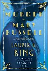
The Murder of Mary Russell: A novel of suspense featuring Mary Russell and Sherlock Holmes
By: Laurie R. King
Rating: 5 of 5
I was late to the starting point with this series. I began reading it with the “Dreaming Spies” and was beginning to work my way through the series from the beginning. I jumped ahead once again to read “The Murder of Mary Russell” as it is just being released. Another great read and one that had me wondering up until the end about where the book was headed.
Wild Savannah: A Coloring Book Adventure (A Millie Marotta Adult Coloring Book)
By: Millie Marotta
Rating: 5 of 5
The video and the photos (including colored designs) are all of the US version of this coloring book unless otherwise noted. I have also reviewed the UK version of the coloring book. I will provide a comparison of the two printings of the book at the end of this review.
I an a real fan of Millie Marotta’s natural world coloring books and have both of her previous coloring books: Animal Kingdom and Tropical World. In Wild Savannah, Ms. Marotta provides a view of animals from various grassland areas all over the world. This includes the traditional African wildlife but also animals of Northern Australian, South America, and even Asia. By taking this point of view, the coloring book is filled with diverse and interesting animals. I was pleasantly surprised by this as my first thought was that it would be more limited in scope.
As with her previous books, Wild Savannah is filled with animal designs including zebras, elephants, rhinoceros, lions, flamingos, various insects, hippopotamus, and much, much more. There are also many designs which include birds of all sorts. Of the 74 designs in the book, five of them are semi-duplicates of the opposite page. As with her other coloring books, Ms. Marotta has included a few of these duplicates which do not contain the high level of detail of their twin. This allows the doodle artist or the blending artist a canvas to make those designs their own.
I am including much more detail about the book below (including comparisons) but here is an overview of what I found in the book:
74 Animal, Insect, Bird, and Plant Designs
Printed on both sides of heavyweight white page
Sewn Binding
Designs merge into binding, including two-page spreads
Alcohol-based markers bleed through
Water-based markers and India ink pens leave shadows on back of page
Gel pens leave shadows on back of page
Coloring pencils work well but don’t blend as well as I would like
The book is in the larger square format at 9 7/8 x 9 7/8 x .5 inches. The book cover is very pretty. It has touches of color and gold foil on the front of the cover. You could certainly color the remainder of the design if you so choose. The inside of the cover is a slick and glossy white.
The designs are printed on both sides of white heavyweight, non-perforated pages. There are also 14 designs which spread across two pages. The pages in my book were aligned okay but not as well as my UK version. There are 60 single page designs. Some of the single page designs and all of the two page designs merge into the binding of the book. As the binding is sewn rather than glued, you can easily remove several pages at a time by snipping a few threads. I was able to break the spine and get the book to lay flat for ease of coloring.
I generally test many types of coloring medium (a list is included below) and this is what I discovered in testing this book:
All alcohol-based markers bleed through the paper easily. All water-based markers either bled through (especially Stabilo) or leave distinct shadows on the backside of the page. My Tombows did the best of the bunch but when I put a second coat on top of the first (as I would for blending) the shadows were quite noticeable. My Pitt India ink artist pens leave a color shadow. My various gel pens left a slight darkening on the backside of the page noticeable but I could not tell the color of each just that they were there.
My coloring pencils did the best of the various medium. They went on well and blended well. The soft pencils went on thick and dark but, across the board, didn’t blend as evenly as I would like. My hard lead pencils went on true to type and did not leave an indent at the back of the page.
These are the coloring medium that I use for testing. If there is something else you feel I should be testing, please let me know and I will see if I can add it to my growing pile:
Alcohol-based markers Copic Sketch, Prismacolor double ended markers (brush and fine point), Sharpies (fine and ultra-fine) Bic Mark-its (fine and ultra-fine)
Waater-based markers Tombows dual end markers (brush and fine point), Stabilo 88, and Staedler triplus fineliners
India Ink: Faber-Castell PITT artist pens (brush tip)
Gel Pens: Sakura, Fiskars, Uni-ball Signo in the following sizes – 0.28/0.38/0.5/1.0 and Tekwriter
Coloring Pencils: Prismacolor Premier Soft Core, Derwent Colorsoft, Prismacolor Verithins, Caran D’Ache Pablo Colored Pencils and Faber-Castell Polychromos
US to UK Comparison:
Here is my comparison between the US and UK version of the coloring book. I will also place this portion of my review in the comments section of my UK review of the coloring book.
I will include a couple of photos that show the difference in paper color and the color of the spines of both books. In both instances, the US version is at the top and the UK version is at the bottom.
There are some distinct differences between the two printings. I don’t think that they make a huge difference but I would like you to know what they are so you can decide for yourself which version works best for your needs.
Cover:
The UK version has fold out flaps at front and back with designs which can be colored. I really like when a publisher includes this feature. The US version does not have fold outs and the inside of the cover is glossy and slick white.
The cover art is the same with slightly different typeface and spacing used on both front and back. The spine on the US version is orange while the spine on the UK version is a light teal.
Size and Weight:
Both books measure the same size. They are 9 7/8 x 9 7/8 x .5 inches. The US version weighs 1.01 pounds and the UK version weights 1.07 pounds. I am guessing that the difference in weight is due to the fold-out cover on the UK version.
Paper, Binding, Print Quality:
The UK version is a cool white while the US version is a warmer white. The US paper is slick to the touch and the UK version has a little more tooth feel to it.
Both books have sewn bindings, however, the UK version is sewn in on a eight page fold while the US version is sewn in on a six page fold. My UK version of the book has a much better alignment on two page spreads than my US version. That may be simply true in my situation and other books may differ in this regards.
Both books have excellent print quality. They have the same designs at the same page in the book. A few of the US designs have been ever so slightly enlarged so that the crop at the edges shows less of the designs. It is limited to only a few designs and nothing essential is lost in those designs compared to the UK version.
Coloring Medium:
My various medium worked similarly with both books with the notable exception of soft lead colored pencils. Interestingly, the UK version (that feels to have more tooth to it) did not take the color as deeply as the US version. However, blending worked much better and more consistently with the UK version. The US book took deeper color with more coverage but when I blended it, I found that the color stayed mostly where I originally put it and blending was uneven because less of the color moved. It looked like I had a darker stain in the middle of my blend. For the most part, with the intricate details of these designs, I am less apt to do much blending; however, I wanted to mention it for those who do this technique.
The designs in this coloring book are full page (edge-to-edge) and most of them are in what I call wallpaper style a design that repeats its elements over and over again. There are a couple of designs which not in this style but I don’t expect that in the case of a book of patterns for these, I expect repeating elements. Many of the designs are complex and detailed and several have intricate and small details that may be difficult for individuals with fine motor or vision issues.
This 24 designs are all licensed from AE Publications Ltd./Shutterstock, Inc. That may mean that you will have seen some of these images before in other books. I have certainly seen some and it is becoming a bit of a disappointment to me that all of Leisure Arts coloring books are so licensed.
As of this date, they have not come out with any original artwork which is odd given they have a huge group of designers in other crafts so I would expect that they would do something similar with adult coloring books. I bought the six books in the set of Art of Coloring but, while this is still a nice coloring book that I like but don’t love, I probably won’t buy any more Leisure Arts coloring books unless they change this model.
I will provide details on the physical book below but here is an overview:
24 Licensed Pattern Designs
Printed on one side of white perforated paper
Stapled Binding
Alcohol and water-based markers bleed through this paper
Gel pens and India ink pens leave shadows of color on the back of the page.
Coloring pencils work well with this paper
The designs are printed on one side of the white perforated paper. The binding is stapled rather than glued or sewn. You can easily release the pages all at once by removing the staples but I prefer to remove pages one at a time at the perforations. I can easily get the book to lay flat by opening and pushing down on the binding. All of the images merge into the binding through the perforations. Nothing of importance will be lost if you remove the designs from the book.
I test my coloring books with various forms of coloring medium (which I will list in the comments section below.) Here are the results of my tests on this book:
All of my markers (fine, ultra-fine, and brush) bled through the paper easily. My gel pens and India ink artist pens either bled through or left color shadows at the back of the page. My coloring pencils worked exceptionally well with this paper. All soft and hard lead pencils went on thick and creamy and I was able to easily blend both types of pencils.
If you want to keep the book complete and use some of the medium that bleed through, put a blotter page under the page you are working on to keep the ink from seeping through. Otherwise, you can simply remove each page from the book at the perforations.
As with all of the Art of Coloring series by Leisure Arts, most of the designs in this book are full page (edge-to-edge) and most of them are in what I call wallpaper style a design that repeats its elements over and over again. Of the three that are not, two are mandalas. Many of the designs are complex and detailed and several have intricate and small details that may be difficult for individuals with fine motor or vision issues.
These 24 designs are all licensed from AE Publications Ltd./Shutterstock, Inc. That may mean that you will have seen some of these images before in other books. I have certainly seen a number of them and have a few of them in other, less expensive coloring books with many more designs in them. I think that the format of this book with thicker paper and perforated pages is better than most but I wish they would do something other than the same designs that other publishers have printed over and over again. The problem is that they are all licensing images from the same company (shutterstock).
As of this date, Leisure Art has not published an adult coloring book with any original artwork. I really find this strange as Leisure Arts has a huge group of designers in other crafts. One could easily expect that they could and would do something original with adult coloring books. I bought the six books in the set of Art of Coloring but, while this is still a nice coloring book that I like but don’t love, I probably won’t buy any more Leisure Arts coloring books unless they change this model.
I will provide details on the physical book below but here is an overview:
24 Licensed Designs with Paisley as a central theme
Printed on one side of white perforated paper
Stapled Binding
Alcohol and water-based markers bleed through this paper
Gel pens and India ink pens leave shadows of color on the back of the page.
Coloring pencils work well with this paper
The designs are printed on one side of the white perforated paper. The binding is stapled rather than glued or sewn. You can easily release the pages all at once by removing the staples but I prefer to remove pages one at a time at the perforations. I can easily get the book to lay flat by opening and pushing down on the binding. All of the images merge into the binding through the perforations. Nothing of importance will be lost if you remove the designs from the book.
I test my coloring books with various forms of coloring medium (which I will list in the comments section below.) Here are the results of my tests on this book:
All of my markers (fine, ultra-fine, and brush) bled through the paper easily. My gel pens and India ink artist pens either bled through or left color shadows at the back of the page. My coloring pencils worked exceptionally well with this paper. All soft and hard lead pencils went on thick and creamy and I was able to easily blend both types of pencils.
If you want to keep the book complete and use some of the medium that bleed through, put a blotter page under the page you are working on to keep the ink from seeping through. Otherwise, you can simply remove each page from the book at the perforations.
The designs in this coloring book are full page (edge-to-edge) and there is a mix of single animal designs and those that I call wallpaper style a design that repeats its elements over and over again. Many of the designs are complex and detailed and several have intricate and small details that may be difficult for individuals with fine motor or vision issues.
This 24 designs are all licensed from AE Publications Ltd./Shutterstock, Inc. That may mean that you will have seen some of these images before in other books. I have at last half of these animals images in other coloring books some without any change and a couple where the pattern has repeated the animals over and over (such as the jellyfish and swan.) I have colored these before and have them in several other books. It is becoming a real disappointment to me that all of Leisure Arts coloring books are so licensed.
As of this date, they have not come out with any original artwork which is odd given they have a huge group of designers in other crafts so I would expect that they would do something similar with adult coloring books. I bought the six books in the set of Art of Coloring and a few of the books I like but this one really is fairly average. I probably won’t buy any more Leisure Arts coloring books unless they change this model.
I will provide details on the physical book below but here is an overview:
24 Licensed Animal Designs
Printed on one side of white perforated paper
Stapled Binding
Alcohol and water-based markers bleed through this paper
Gel pens and India ink pens leave shadows of color on the back of the page.
Coloring pencils work well with this paper
The designs are printed on one side of the white perforated paper. The binding is stapled rather than glued or sewn. You can easily release the pages all at once by removing the staples but I prefer to remove pages one at a time at the perforations. I can easily get the book to lay flat by opening and pushing down on the binding. All of the images merge into the binding through the perforations. Nothing of importance will be lost if you remove the designs from the book.
I test my coloring books with various forms of coloring medium (which I will list in the comments section below.) Here are the results of my tests on this book:
All of my markers (fine, ultra-fine, and brush) bled through the paper easily. My gel pens and India ink artist pens either bled through or left color shadows at the back of the page. My coloring pencils worked exceptionally well with this paper. All soft and hard lead pencils went on thick and creamy and I was able to easily blend both types of pencils.
If you want to keep the book complete and use some of the medium that bleed through, put a blotter page under the page you are working on to keep the ink from seeping through. Otherwise, you can simply remove each page from the book at the perforations.