
Search
Reviews by Category
-
Recent Posts
Archives
- February 2022 (1)
- January 2022 (2)
- December 2021 (2)
- November 2021 (5)
- October 2021 (4)
- September 2021 (4)
- August 2021 (5)
- July 2021 (4)
- June 2021 (6)
- May 2021 (5)
- April 2021 (4)
- March 2021 (5)
- February 2021 (5)
- January 2021 (5)
- December 2020 (5)
- November 2020 (5)
- October 2020 (9)
- September 2020 (8)
- August 2020 (6)
- July 2020 (7)
- June 2020 (11)
- May 2020 (6)
- April 2020 (8)
- March 2020 (5)
- February 2020 (8)
- January 2020 (5)
- December 2019 (8)
- November 2019 (6)
- October 2019 (11)
- September 2019 (11)
- August 2019 (8)
- July 2019 (12)
- June 2019 (10)
- May 2019 (8)
- April 2019 (5)
- March 2019 (4)
- February 2019 (4)
- January 2019 (4)
- December 2018 (16)
- November 2018 (20)
- October 2018 (25)
- September 2018 (20)
- August 2018 (26)
- July 2018 (25)
- June 2018 (23)
- May 2018 (25)
- April 2018 (28)
- March 2018 (24)
- February 2018 (23)
- January 2018 (26)
- December 2017 (12)
- November 2017 (10)
- October 2017 (37)
- September 2017 (48)
- August 2017 (19)
- July 2017 (30)
- June 2017 (30)
- May 2017 (44)
- April 2017 (32)
- March 2017 (49)
- February 2017 (32)
- January 2017 (54)
- December 2016 (29)
- November 2016 (36)
- October 2016 (39)
- September 2016 (31)
- August 2016 (49)
- July 2016 (64)
- June 2016 (52)
- May 2016 (52)
- April 2016 (66)
- March 2016 (72)
- February 2016 (60)
- January 2016 (59)
- December 2015 (72)
- November 2015 (81)
- October 2015 (59)
- September 2015 (41)
- August 2015 (33)
- July 2015 (30)
- June 2015 (25)
- May 2015 (42)
- April 2015 (40)
- March 2015 (32)
- February 2015 (25)
-
Net Galley
Monthly Archives: June 2016
Another thriller of a read with real world overtones
First Strike: A Thriller (A Dewey Andreas Novel)
By: Ben Coes
Rating: 5 of 5
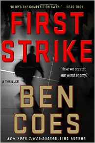 I picked up this series beginning with the last book, “Independence Day” and was so pleased with the book that picking up “First Strike” was an easy choice. The book takes up shortly after the last one ended and, once again, there is a rush of adventures that culminate with a satisfying end.
The story could have been taken from today’s headlines. It was shocking to have a book talk so much about the atrocities that ISIS is responsible for. At first, I felt like I didn’t want to read about them and then I realized that I should because the author is honest in his appraisal and descriptions of the horrors that this group unleashes.
Posted in Mystery/Suspense/Thriller
Leave a comment
Charts Only with no written instructions but with lots of cable examples
Cable Left, Cable Right: 94 Knitted Cables
By: Judith Durant
Rating: 3 of 5
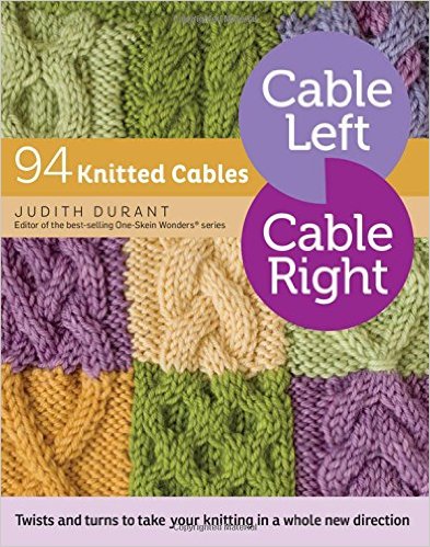 “Cable Left Cable Right” by Judith Durant is the latest in a series of books by Storey Publishing. One of the previous books, “Increase Decrease” is by the same author.
The book contains a great number of variations of cables and would have been a perfect resource for me but for the fact that it contains only charts – there are no written instructions. I can follow charts easily for cross stitch and needlepoint but I find that for knitting and crochet, I prefer written instructions along with charts. I follow the written instructions and then use the charts for the tricky bits.
Posted in Needlework/Arts/Crafts
Leave a comment
Great artwork and improved paper but the UK version is still slightly better for my use
Imagimorphia: An Extreme Coloring and Search Challenge
By: Kerby Rosanes
Rating: 4 of 5
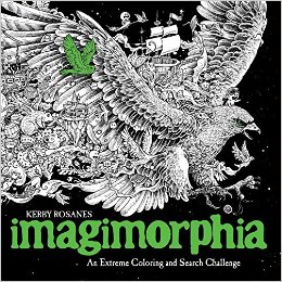 I will attach a silent flip-through video to this review. The book in the video and in the photos are only of the US version of this book except photos where I show both books. In those cases, the UK version is at the top and the US version is at the bottom.
I purchased both the UK and the US version of this book. I reviewed the UK version on Amazon on April 23rd of this year. As I noted at that time, I really enjoy Kerby Rosanes artwork which includes an unusual look at design and I have a really fun time coloring all the little odds and ends that make up the full design. I found that I actually liked Imagimorphia even more than Animorphia which was difficult to do as I so enjoyed his first book in this series. It still has a good number of animals in it but it expands beyond them into other design concepts as well.
So, the designs are great, as expected, but what about the publishing quality of the US published book? The UK version was published in exactly the same fashion as the UK version of Animorphia. I was dreading that might be the case with the US version as well. What actually arrived was a coloring book printed on a much heavier weight of paper than the US Animorphia book. It actually weighs slightly more than the UK version either a slightly heavier paper or the slightly larger size of book or a combination of both of these. The US version weighs in at 1.07 lbs. and the UK version weighs in at 1.03 lbs. The US version measures at 10 x 10 x 3/8 inches and the UK version is 9 7/8 x 9 7/8 x 3/8 inches.
That is good and a great improvement since the last book but there are some more subtle differences in the publishing that still makes me prefer the UK version. If I didn’t have access to the UK version, I would have been okay with the US one but I still would have been a little bit unhappy with a couple of issues. The two most important of these are the binding and the texture of the paper.
The UK version has a sewn binding and the US is glue bound. The UK version has the design right into the binding and the US has a white strip (when you can get the book to fully open which is impossible for me on some of the pages.) Where this is most evident and least desirable is on two-page spread designs. Right in the middle of the design is a quarter inch strip of nothingness. I have no problem getting the pages to open on the UK version because they are sewn rather than glued. I did have to break the spine with a heavy crease, but I was able to get at all of the design without at white strip.
The texture of the paper is important for me as I use colored pencils for my work (due to the double-sided printing and the leak-through of markers.) The US version of the book is very smooth almost slick. The UK version of the book has a slightly smooth but with enough tooth for colored pencils. My pencils had more of a smeary type of look with the US version.
Other small differences include color of paper and print. The UK is brighter white with darker print. The US is softer white with slightly lighter print. The covers are different in texture and color. The UK is matte black with glossy highlights on the designs and title. The US is a softer matte and there are no glossy highlights.
The designs are all the same though there is a slight switch up of pages in the title and bookplate pages between the two versions.
Here is what I experienced while coloring in this book and testing my various coloring medium.
43 Different Designs in a variety of subjects
Designs are printed on both sides of heavyweight soft white extremely smooth non-perforated paper
Most designs spread across two pages
Two page designs have a white strip running down both sides of the page at the binding
Glue Binding
Had difficulty getting the book to open flat for coloring
Alcohol-based markers bleed through
Most water-based markers bleed through spotty (exception was the brush end of my Tombows which did not bleed through)
India ink pens left shadows on the back of the page.
Gel pens did not leak through the paper.
Coloring pencils do not do as well with this paper. The paper is extremely smooth and did not provide good tooth (or grip) for the color to adhere evenly. Both my wax and oil-based pencils provided a kind of smeary uneven color.
Posted in Adult Color Books
Leave a comment
Great Fun coloring youthful versions of the Marvel superheros and super villains printed on one side of perforated pages
Color Your Own Young Marvel by Skottie Young
By: Skottie Young
Rating: 5 of 5
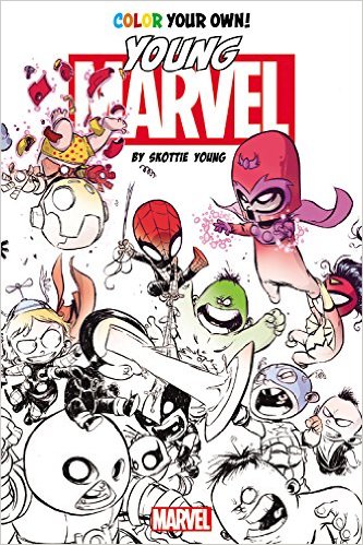 This coloring book is simply excellent fun. For anyone who enjoys Marvel Comics, the designs in this book can bring a smile to your face. Who would think that the good guys and the bad guys were such adorable youngsters.
As soon as the coloring book arrived, my husband and I started a bit of a tug-of-war over it. I won but we are ordering a copy for him as well. I’m hoping to see more of this type of comic coloring book in the future. The printing and publishing of the book is spot on with one sided printing and perforated pages.
I plan on doing some designs in the traditional colors of garb associated with each character but then I want to play a bit with color and give them my version of their costume. My only problem with the book was deciding which character(s) to start with. I definitely did not start with the first page and go from there. I looked for something fun and found Deadpool. He was fun and easy to color with alcohol-based markers with a little colored pencil accent as well.
This is what I experienced while coloring in this book and testing my color medium on the paper:
59 Young Marvel character designs in a slightly smaller format
Designs are printed on one side of the page
Paper is medium weight, white, slightly rough, and perforated
Glue bound but you can easily remove pages at the perforations
Design may cross over the perforations by a tad but nothing of importance will be lost if you remove a page from the book.
Easy to get at all corners of the design (though many designs reach extend border of the page on three sides.
Alcohol-based markers bleed through this paper
Water-based markers, India ink pens, and gel pens all leave colorful shadows on the back of the page.
Colored pencils work well with this paper. I was able to get good color, blend, and layer well with both wax and oil based pencils. Hard lead pencils can dent through the page.
I recommend either removing the page from the book to color or putting a safety blotter page under the page you are working on. That will keep the pages below safe from seeping ink or dents.
Posted in Adult Color Books
Leave a comment
31 Winter Scenes with tiny
Creative Haven Winter Wonderland Coloring Book (Adult Coloring)
By: Teresa Goodridge
Rating: 4 of 5
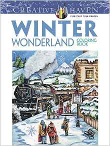 I like the concept of this coloring book. Where it falls down a tad for me is in the actual execution of some of the designs. For instance, in a number of designs, the faces of people turn into black blobs because too much detail was put into too small a spot. At best, I may be able to use a flesh tone marker on those spots; at worst, I’ll have to leave them as-is. This is a problem that is repeated in other elements throughout the designs. While I can work with it, I think it is important to note for those who cannot or prefer not to work with tiny details in their coloring.
What I do take exception to is that the sample artwork on the cover and on the inside of the front and back cover are of the artist’s actual painting and not of a colored design from the book. The closest the book comes to an actual sample is the partially colored design on the back of the book and that looks suspiciously like it has been done using a digital paint program rather than actual coloring by hand. Based on the coloring books I have purchased in this past by Creative Haven, this is a big departure from their usual way of presenting coloring books.
The designs have a much more cartoon feel to them than the original painted artwork. I think that may have played into the use of the painting instead of an actual colored sample. When I pre-ordered my copy, there was no Look Inside available so I was purchasing based on the cover art. The Look Inside now shows images that are consistent with how the book is actually printed.
The designs are winter scenes with snow falling in most designs. My plan is to try to color around the snow and then use white gel pen if needed. The scenes show houses, children, horses, skaters, and much more that we associate with winter. While it is not a holiday book, there are some designs that are definitely associated with Christmas. As I love to color Christmas designs, I am sure to enjoy the challenge of coloring these in particular.
This is what I found when coloring in this book and testing my coloring medium on the paper:
31 Winter Scene Designs with lots of snowfall
Printed on one side of the page
Paper is standard for Creative Haven: medium weight, white, lightly rough and perforated
Glue bound but pages can be removed easily at perforations
Designs stop before the perforations
Alcohol and water based markers bleed through to some degree
Gel pens and India ink pens leave shadows of color on the back of the page
Coloring pencils work well with this paper. Both wax and oil based pencils lay down good color, layer and blend well. Hard lead pencils leave dents on the back of the page.
Posted in Adult Color Books
Leave a comment
31 Mandala style window designs with special effects printed on one side of the page
Creative Haven Rose Windows Coloring Book: Create Illuminated Stained Glass Special Effects (Adult Coloring)
By: Joel S. Avren
Rating: 4 of 5
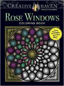 This is a coloring book that purports to give the colorist the ability to have a stained glass look to their coloring if they use wax crayons. I tried wax crayons as well as wax-based colored pencils, oil-based colored pencils, alcohol-based markers and water-based markers. While I did like the effect that I got with the wax crayons as well as I did the different effect that I got from alcohol-based markers, I can’t say that it looked like a stained glass window.
Using wax crayons gave the finished design a glossy look as well as a translucence. Using alcohol-based markers were translucent but not glossy. The other mediums worked okay as well but while some colors were translucent, others did not. Perhaps that was due to a color having a deeper pigment than others.
Other than not agreeing with the whole stained glass concept of the book, I liked the designs. They appear to be more of a gray scale design than one with special effects. I did note that all of the designs presented a moir pattern when I recorded the video and, to a lesser extent, when I took sample photos. Because of that, I assume that there is some sort of special print method being used to enhance the stained glass effect once the designs are colored.
I found that I liked coloring the designs in the book even though I didn’t feel that the end result looked like an illuminated window. The designs were easy to color if with mostly open areas to fill in. Because of the heavy dark grays, I’m not sure that someone with vision issues would find it as easy as I did.
This is what I found out about the book while coloring in it and testing various coloring medium:
31 Mandala style stained glass window type designs
Printed in heavy gray/black tones on one side of the page
Paper is medium weight, white, lightly rough and perforated as usual for Creative Haven coloring books
Glue bound but pages can be removed easily at perforations
Designs stop before the perforations
Alcohol and water based markers bleed through to some degree
Gel pens and India ink pens leave shadows of color on the back of the page
Coloring pencils work well with this standard Creative Haven paper. Both wax and oil based pencils lay down good color, layer and blend well. Hard lead pencils leave dents on the back of the page.
Posted in Adult Color Books
Leave a comment
62 pages of Tree inspired coloring designs printed on both sides of the page
Keep Calm and Color — Tranquil Trees Coloring Book (Adult Coloring)
By: Marica Zottino
Rating: 4 of 5
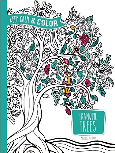 I was very surprised to see that this new book by Dover Publishing was printed on both sides of the page. Further, the pages are not perforated. Given the success of their Creative Haven and Sparks lines and their new Escapes line, I would have thought they would understand that printing on one side of the page with perforated pages is generally thought to be a good thing. For me, the publishing aspect of this line of books (Keep Calm & Color) is a huge step back. I purchased only one of three new books in this line and will probably not purchase the other two based on how they were printed.
The designs are actually a reprint of a French book from 2015, Ma Pause Nature A Colrier Arbres de Vie by Rustica Editions. That doesn’t bother me as many international artists are now finding US publishing groups to make their books available in the US. For me, that’s a great thing and I have a number of coloring books that fall into that category.
The designs are tree-related but with imaginative twists. Most of the designs are single page designs but there are a number which spread across two pages. Some of the two-page designs don’t line up extremely well in my book. Be prepared there are a lot of leaves in this book. That makes sense as it is about trees but there are lot of them and I wanted to mention it specifically.
This is what I found while coloring in this book and testing my coloring medium on the page:
62 pages of tree-inspired designs
Designs are printed on both sides of the page
10 Designs spread across two pages
Paper is medium weight, white, slightly rough and non-perforated
Glue Bound
Alcohol-based markers bleed through this paper
Water-based makers bleed through in spots with this paper
Gel pens and India ink artist pens leave colorful shadows on the back of the page
Colored pencils work well with this paper. It has a decent amount of texture to it and both wax and oil based pencils lay good nice pigment, layer and blend well. Hard lead pencils can dent/score through to the back of the page.
Posted in Adult Color Books
Leave a comment
25 x 2 cute Halloween Designs featuring Big Eye Girls printed on one side of the page
Sherri Baldy My-Besties TM Halloween Coloring Book BOO!
By: Sherri Ann Baldy
Rating: 5 of 5
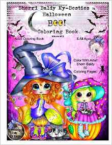 I own a few of Sherri Baldy’s coloring books and was really happy to see that she had released one that features Halloween designs. The designs feature her cute little big eye girls in various poses and costumes. There are lots of cute designs and, as with all of her coloring books, she provides you with two copies each of the 25 designs in the book. I really appreciate that as it allows me to explore two color ways with each design or to share a design with a friend. There are pirates, witches, animals and lots of pumpkins with easy to color designs.
I have a lot of fun coloring these see little girls. I like to color these in between more difficult and complex projects. It’s wonderful to have something to color that I can easily finish in an afternoon. My preference for coloring her designs is to use markers and then colored pencils on top for details and shading.
This is what I experienced while coloring in this book and testing the paper with my various coloring medium:
25 x 2 Big Eye Girls in Halloween costumes (50 total pages to color)
Printed on one side of the page
Paper is typical for CreateSpace publications white, thin, slightly rough and non-perforated
Glue Bound
Designs do not merge into the binding area
Alcohol and water based markers all bleed through the page though alcohol bleed through more fully and quickly while water based spot through.
Gel pens and India ink pens leave colorful shadows at the back of the page. India ink can bleed through if you use repeated layers or try to blend several colors.
Colored pencils work well with this paper. Both oil and wax based could be used with a light or firm hand. I use a light hand and get good pigment color by repeated layers and use of my blending pencils. Layering and blending work well with this paper. My hard lead pencils like Verithins dent or score through to the back of the page.
I use and recommend the use of a blotter page of some sort. I use card stock but heavyweight paper or several sheets of regular white paper work as well.
Posted in Adult Color Books
Leave a comment
38 Judaic Designs beautifully drawn and printed on one side of the page
Hebrew Illuminations Coloring Book: A Coloring Journey Through the Jewish Holy Days — A Coloring Book for Adults by Adam Rhine
By: Adam Rhine
Rating: 5 of 5
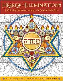 This is a beautiful coloring book of designs by Adam Rhine. The artwork I have seen by Mr. Rhine are exquisite watercolors. The designs in this book have been derived from those designs and are presented as black line drawings on medium weight paper.
These designs are a rendering of the Jewish Holy Days. The designs are printed on the right hand side of the page and, except for the first design which has its explanation directly on the design page, there is a bit of information about the Holy day on the left hand side of the page. The name of the day is written in English and Hebrew (using the English alphabet) and has an excerpt from various sources such as the Torah, Psalms, Proverbs, prayers, etc.
The designs are beautiful to look at as well as to color. There is a lovely level of detail that provides a nice challenge in coloring each one. There is a quote from the artist in the book that I really appreciate and agree with: The act of creation brings us closer to God in ways unique to each of us. What a beautiful way of expressing the joy and inner peace that can be found in creating something such as coloring a beautiful design.
While I am not Jewish, I really appreciate this coloring book as a guide through the Jewish Holy days. I’ve learned about a few of them in Bible studies throughout my life and am very interested to learn about more of them. A small group of family and friends will be using this book as a integral part of our study in the coming weeks and months.
This is what I discovered while coloring in this book:
38 Intricate full page Judaic motifs about the Jewish Holy Days
Designs are printed on one side of the page while information is printed on the opposite side of the page.
Paper is heavy weight, white, lightly smooth, and non-perforated
Glue Bound
Designs do not merge into the binding
Alcohol and water-based markers seep through the paper to varying degrees
India ink pens leave colorful shadows on the back of the page
Gel pens do not seep through the paper
Colored pencils work well with this paper. I was able to get good color, blend and layer well with hard and soft core pencils whether they were oil or wax based.
I was provided a free sample of this book for test and review purposes. I have since bought multiple copies for family and friends to use as noted above.
Posted in Adult Color Books
Leave a comment
15 Feet of continuous coloring fun with lots of silly and fun Ocean designs – printed on one side of continuous fold-out page
To The Ocean Deep: The Longest Coloring Book in the World
By: Sarah Yoon
Rating: 5 of 5
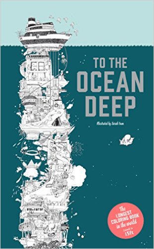 I recently finished my first fold-out kind of coloring book (by another publisher) and having enjoyed that one so much, I decided to try out the really long fold-out design by artist Sarah Yoon. This coloring book unfolds in a continuous sheet to a full fifteen feet long.
The ocean background is pre-colored in a light to deep green (it gets darker as you get closer to the bottom.) The actual designs are black lines on white. I found that the pages are a little to maneuver unless you have a really big area in which you color. I found that folding the pages the opposite direction from the way they came also helped keep the fold-out manageable.
The design concept is a long tower that reaches from a ship at the surface of the ocean down to the ocean floor. Above the ship are what looks like cloud cities so you have some fun to color at the top as well. The tower is filled with all sorts of characters and elements it reminds me of some of the crazy cartoon designs I used to see in Mad magazine as a child. There are robots, castles, sea creatures, stairways, trees and more. They make up the pathway to the ocean bottom where a treasure chest awaits you.
This is what I experienced while coloring in this book and testing my various coloring medium on the paper.
15 page continuous fold-out cartoon Ocean theme designs
Printed on one side of the page
Paper is heavyweight, lightly smooth, filled background, non-perforated. The final page is glued to the cardboard backing while the other 14 pages fold out.
Cover (front and back) is a lightweight cardboard.
Alcohol-based markers seep through the paper
Water-based markers, India ink artist pens and gel pens did not seep through the paper
Colored pencils worked well with this paper. I was able to get good color, layer, and blend well with both oil and wax based pencils.
Posted in Adult Color Books
Leave a comment